The mark on its grounds
Mono, dark
Mono, light
On gradient
System ready · 2026
Read case study→Case study 01 · RIPS Technologies · Bochum · 2017—2020
Accompanying a security product from scan to trade fair
Build a brand and grow both sales and marketing, making RIPS visible to anyone close to security testing applications.
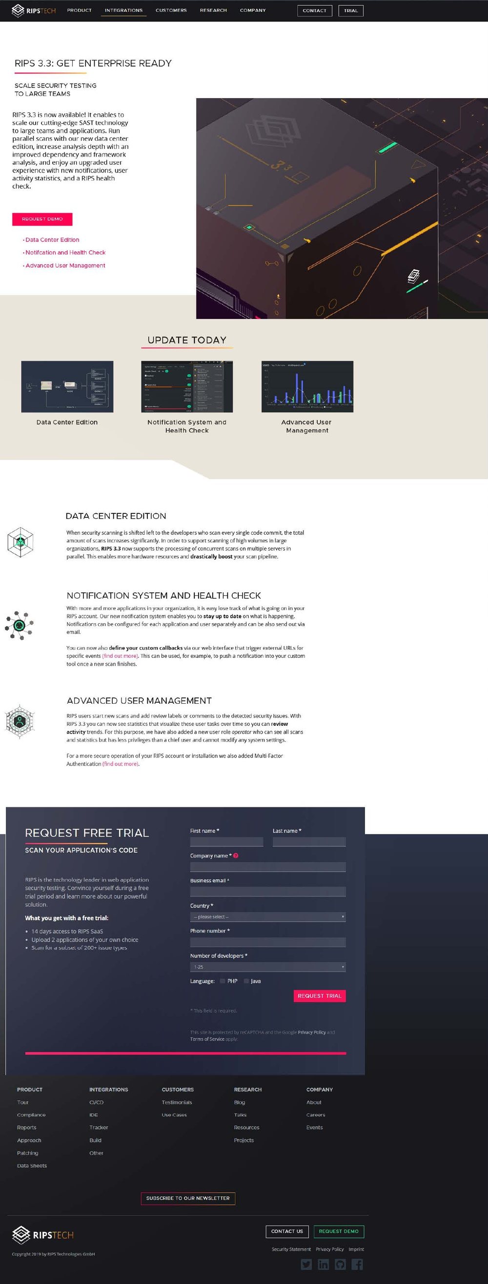
+80 % more people entering the sales funnel through site and blog within six months of the relaunch.
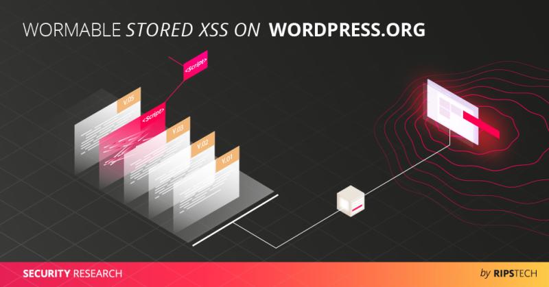
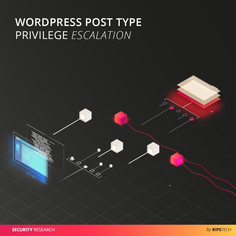
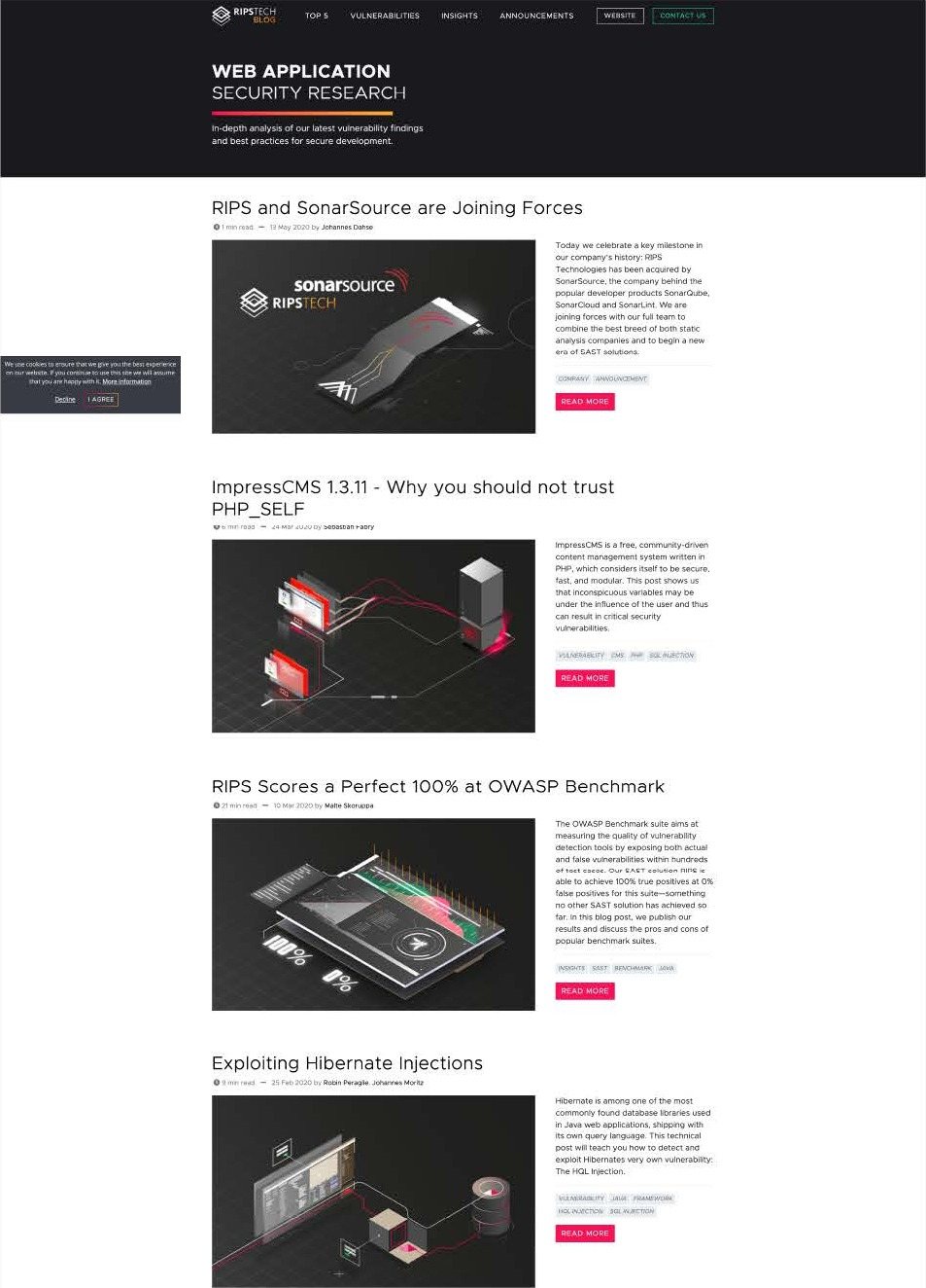
The illustrations lifted the blog and made each finding real to readers. That proved what the engine could do.
Acquired by SonarSource in May 2020, with the team and the site kept as its German R&D centre.
Sole designer for three years: product interface, brand, website, every illustration, trade fair stands and the building itself. Identified the missing marketing role, argued for it, and got the hire.
In security testing there is a constant tug of war between clarity and precision. I think I was able to create win-win situations and provide more clarity to a fuzzy flow while maintaining complexity where needed.
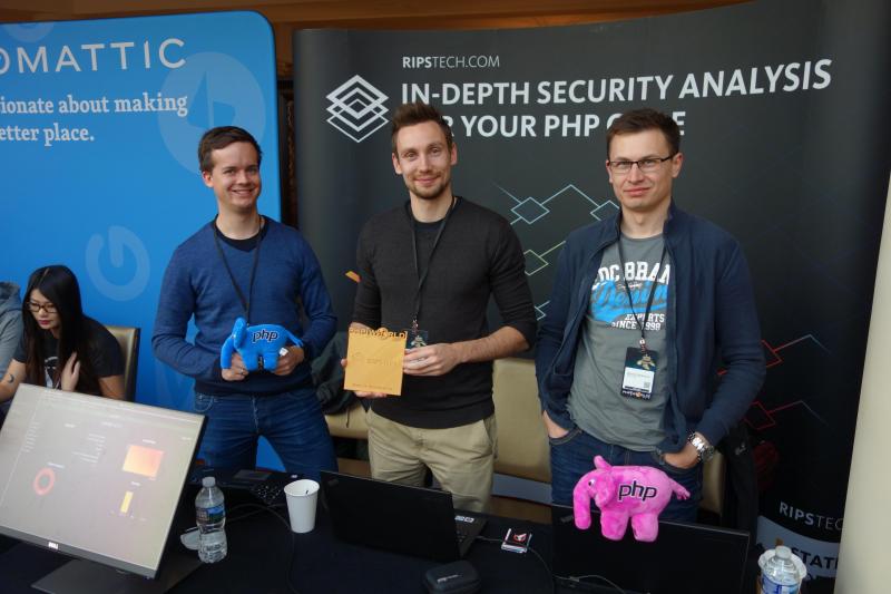
Ripstech started as a static security testing solution from the incubator in Bochum, Germany, founded by three student friends who built an open source tool into a scalable business. The brilliant Dr. J. Dahse managed to put every PHP function into each other, allowing the RIPS Technology Engine to perform not only faster scans and ranking the results, but also auto-suggest solutions and bugfixes, long before LLM agents took over.
The mark is three stacked squares, one for each founder. They are drawn as outlines because RIPS started as an open-source tool. Each outline is thinner than the one above it, the way each scan takes a little more risk out of the code. Colour appears only in the word TECH, in the gradient the engine used for its severity scale, running from critical red to medium yellow.
RIPS is heavier than TECH. On a black or near-black ground the gradient may fill TECH, and only TECH — the mark and RIPS stay white, and the gradient never runs behind the lockup as a field. The wordmark is never set in another face.
16 px is the floor on screen, 8 mm in print. Below that the inner outlines close up and the mark turns into a solid diamond.
Clear space is the height of one band of the mark, on all four sides. Nothing sits inside it — no type, no rule, no edge of a photograph.
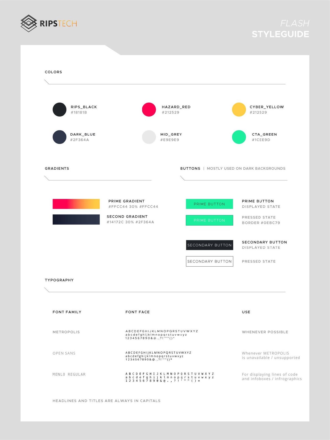
The palette is a severity scale first and a brand palette second. That is the whole idea: the colour that means critical in the product is the same colour that carries the logo on the trade fair wall.
Hot to warm, 150° on a plate, 90° on a bar. It runs through the severity scale, which is why it reads as the product and not as decoration. It is never reversed, never three-stop with a foreign colour, and never used behind body text.
The neutrals carry a blue bias, not a flat grey. On a screen full of red and amber a neutral grey goes muddy; pulling it toward blue keeps the severity colours clean.
| Token | Hex | Ratio | Use |
|---|---|---|---|
| ui/ink | #E9EDF1 | 16.4 : 1 | Any size. |
| brand/warm | #FFCB44 | 12.9 : 1 | Any size. |
| ui/body | #A9B6C2 | 9.3 : 1 | Any size. |
| brand/mid | #FF7A33 | 7.4 : 1 | Any size. |
| brand/hot | #FF014D | 4.9 : 1 | 16 px and up, or bold. Not for body copy. |
| ui/muted | #6C7A88 | 4.4 : 1 | Labels and metadata only. Never a sentence a user must read. |
brand/hot clears AA for large text but not for small body copy. In the product it appears as a chip, a number, a bar or a button fill — never as a paragraph.
Open Sans and IBM Plex Mono.
Everything is a multiple of 4. Inside a component: 4, 8, 12. Between components: 16, 24. Between sections: 32, 48. Nothing in between, and no arbitrary 15 or 30.
12 columns, 24 px gutter, 32 px page margin. The product sidebar is a fixed 17% and sits outside the grid.
0 everywhere. No rounded corners on buttons, cards, inputs, chips or plates. The mark is the only diagonal on the page.
160 ms, ease-out, opacity and transform only. No bounce, no spring, no staggered entrances in the product.
24 px, 2 px stroke, 2 px inner padding. Solid fill, no outline-and-fill mix within one view.
1 px, ui/line. Tables are ruled on the horizontal only — no vertical rules, no zebra fills.
None in the product. Depth comes from the panel fill being one step lighter than the ground, not from shadow.
52 marks drawn for the product. The first thirteen are review states and carry the brand colour; the other 39 are interface furniture and stay neutral. Hover a tile for its name.
24 px box, 2 px safe margin, 2 px stroke.
The set is solid. Counters are cut out of the shape rather than drawn as a second stroke, which is what keeps it legible at 16 px in a table row.
An icon takes brand/hot only when it carries a review state. A folder is never red. A red folder means the colour has stopped meaning anything.
Gradient plate. The default. Carries the mark, a number or nothing at all.
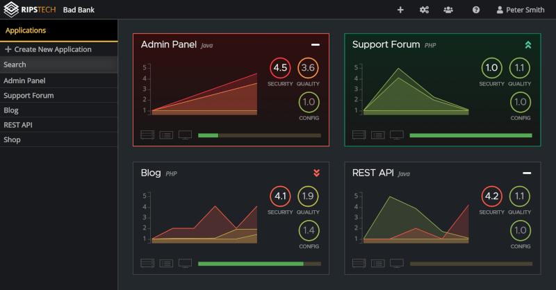
Product screen. Real data, real severity colours. Never a fabricated dashboard.
$id = $_GET['order'];
$sql .= " WHERE id = " . $id;
return $db->query($sql);
Code. Set in Plex Mono, highlighted with source and sink colours only.
The product finds real problems in real code. Every one of the above says the opposite.
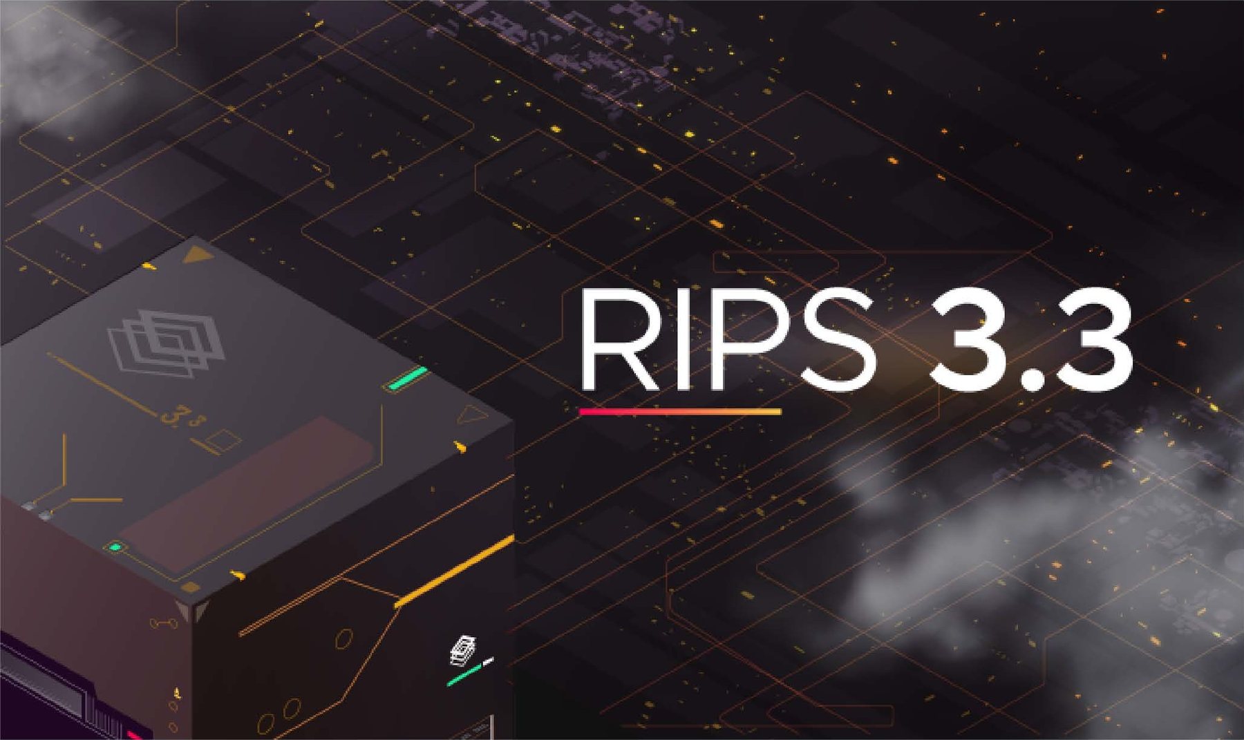
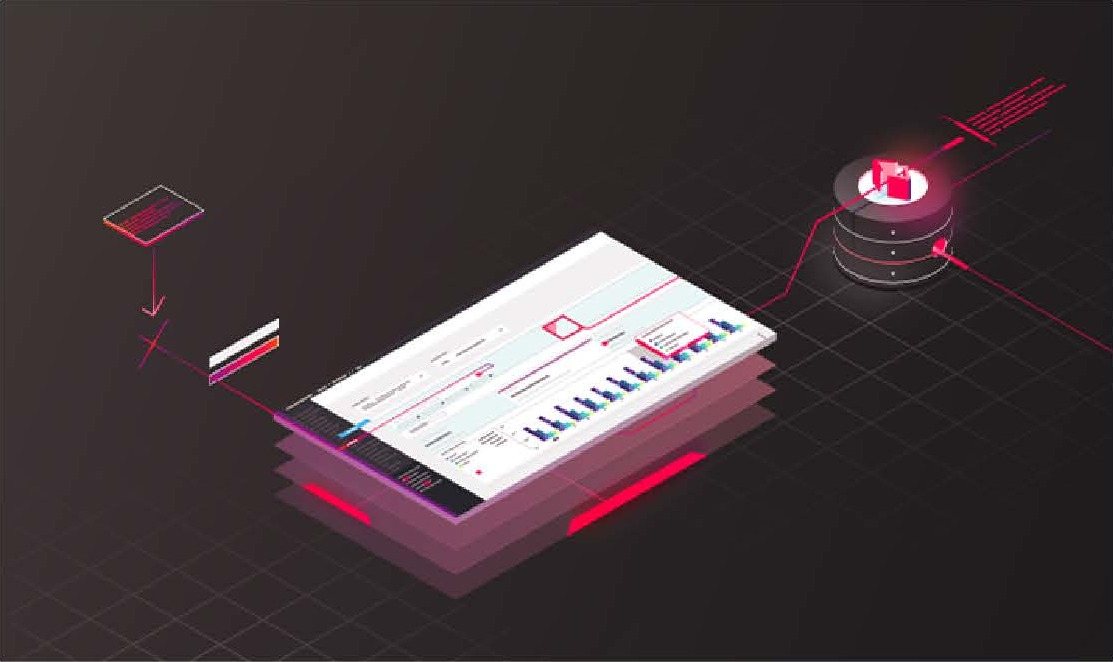
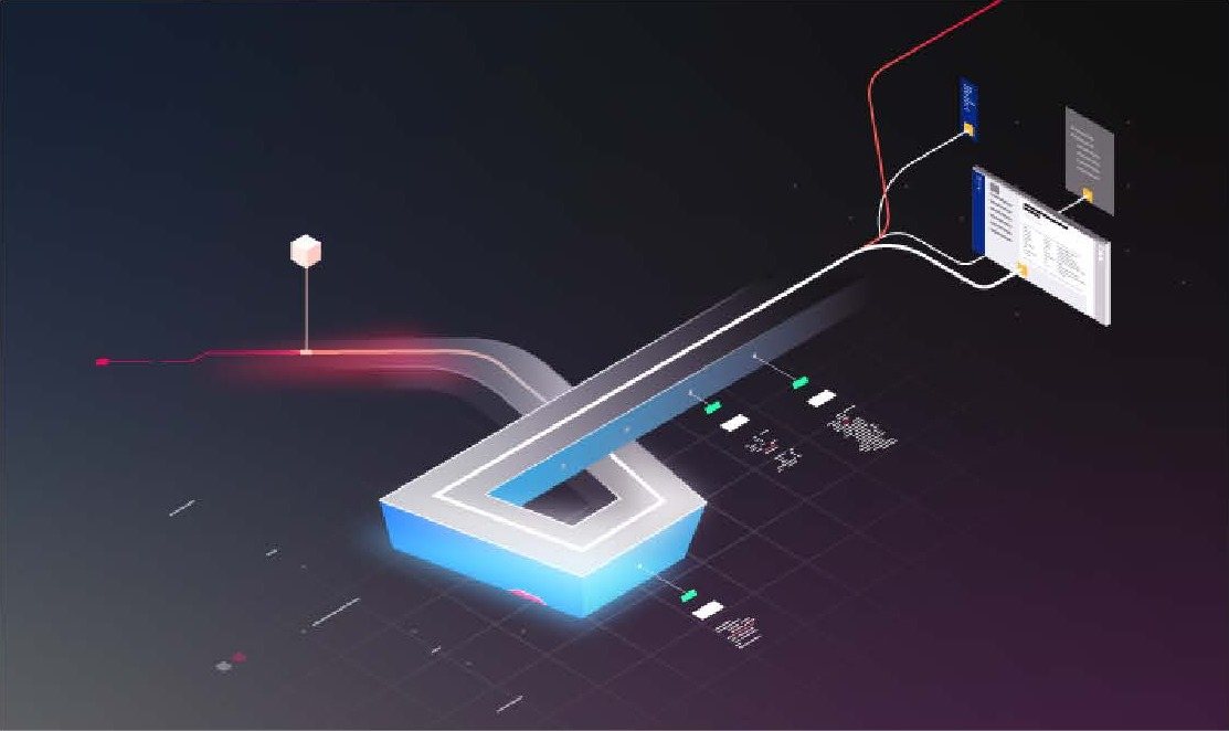
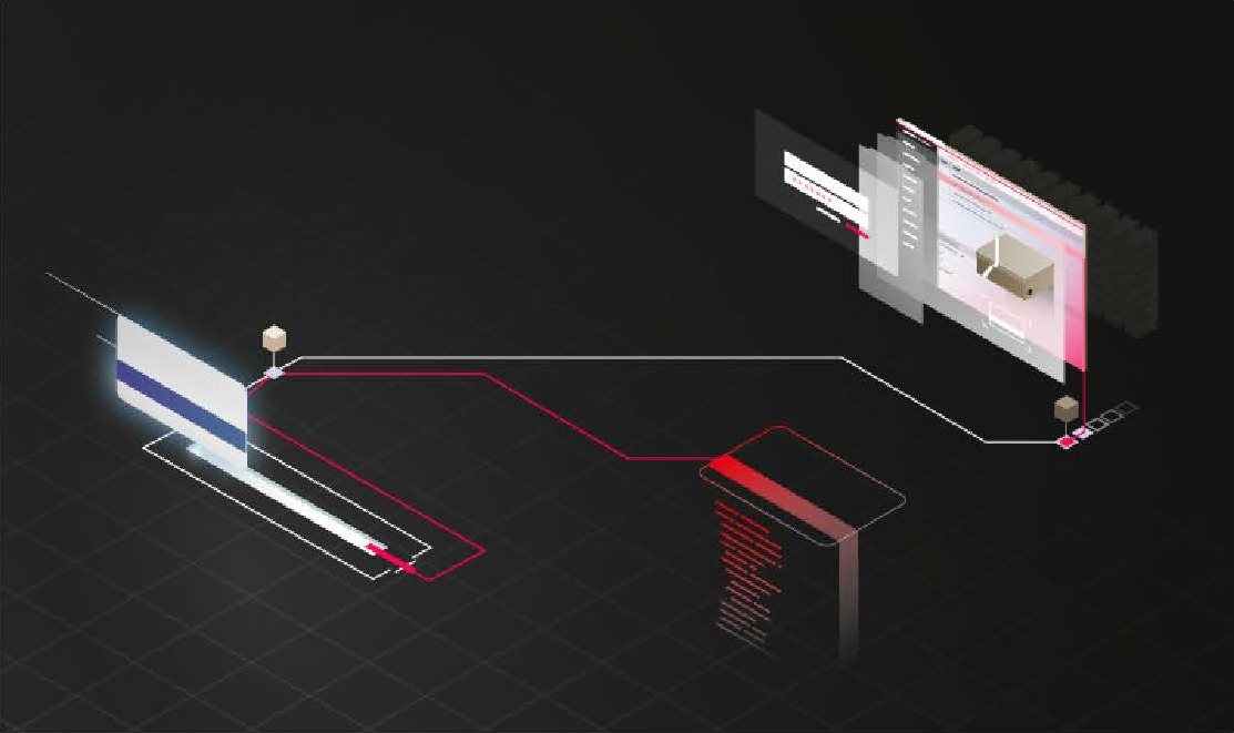
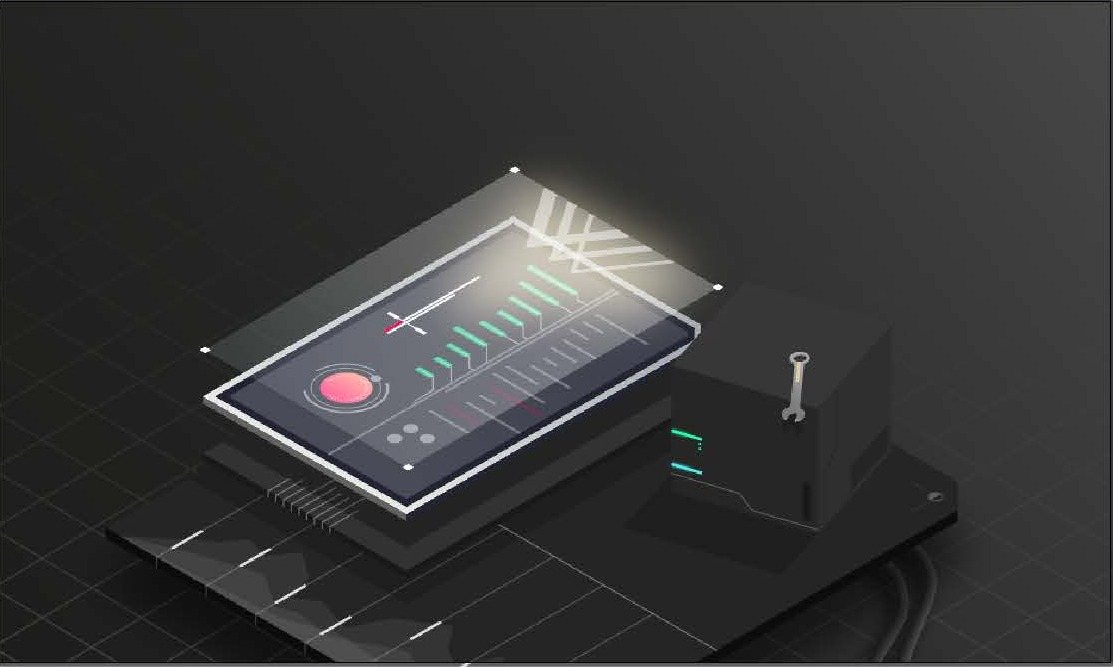
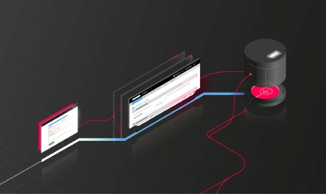
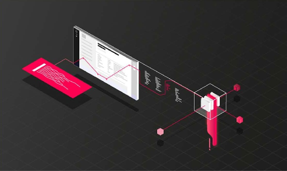
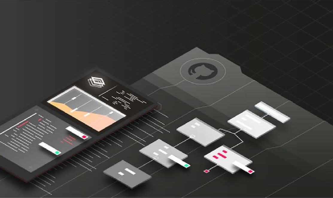
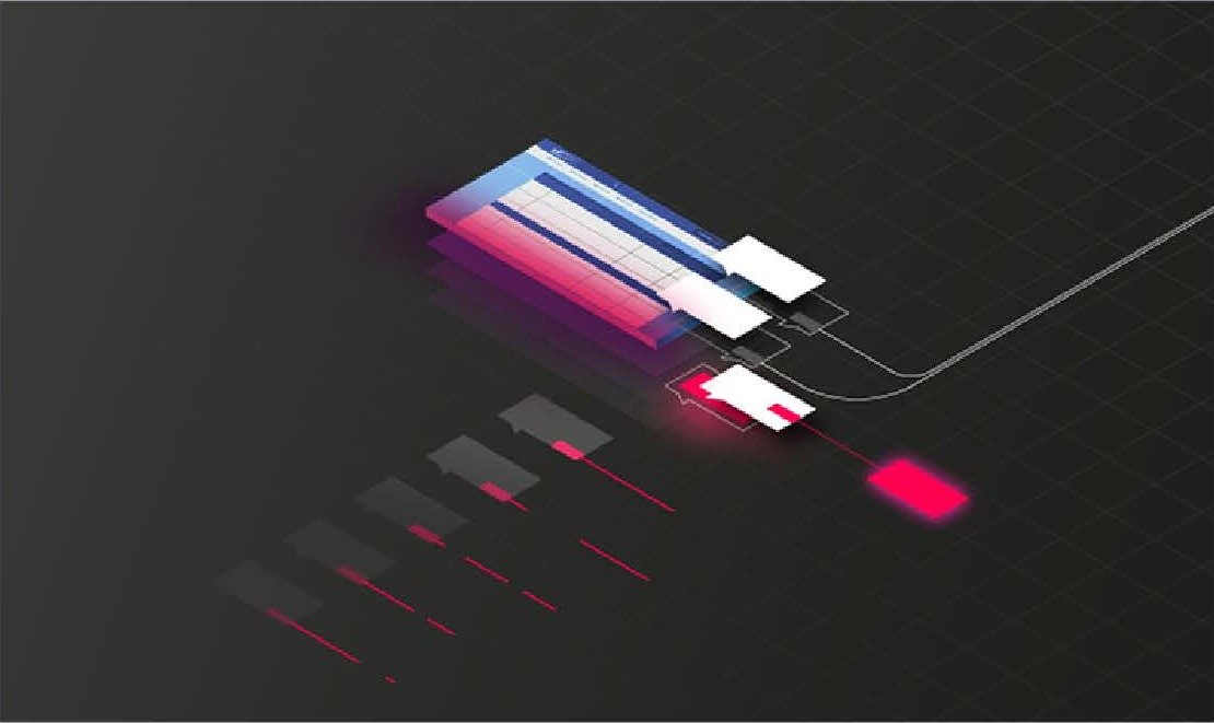
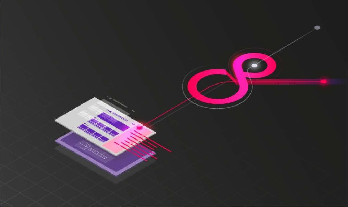
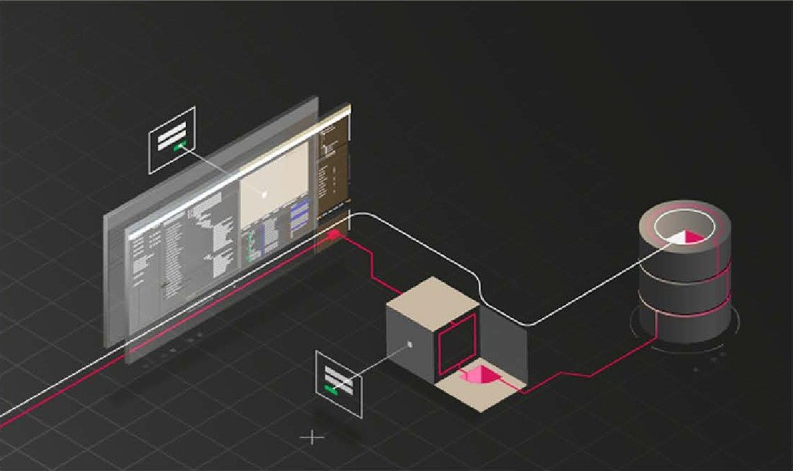
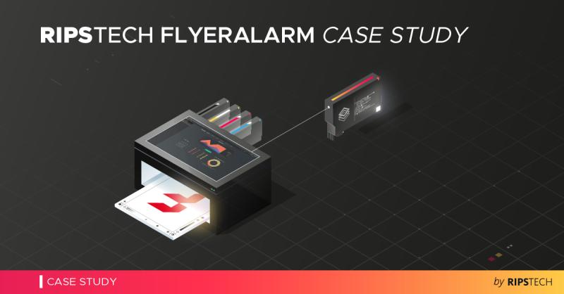
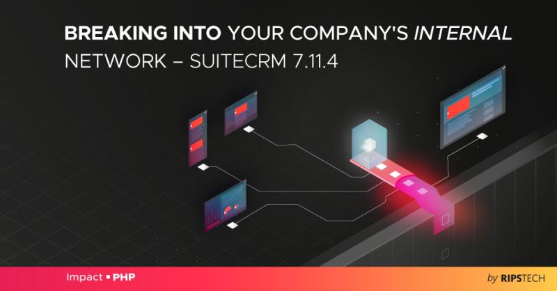
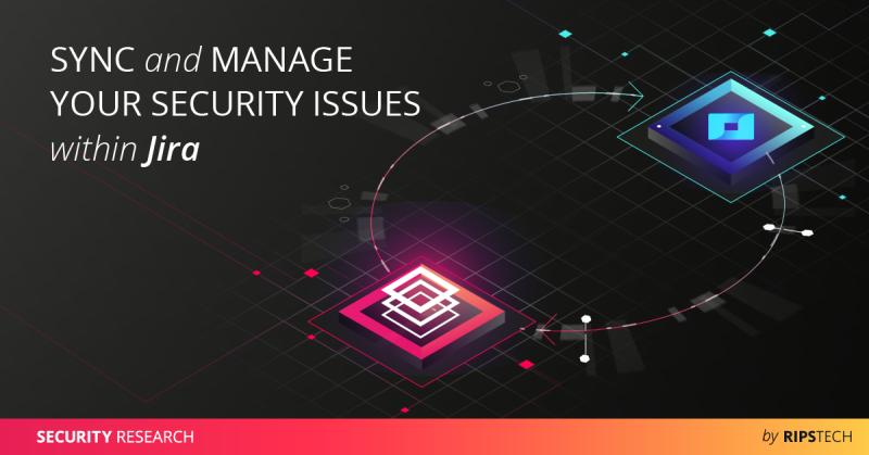
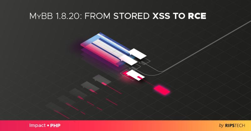
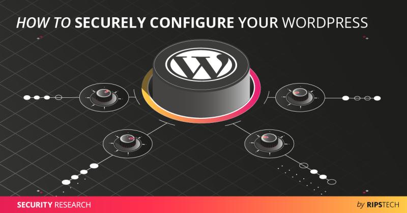
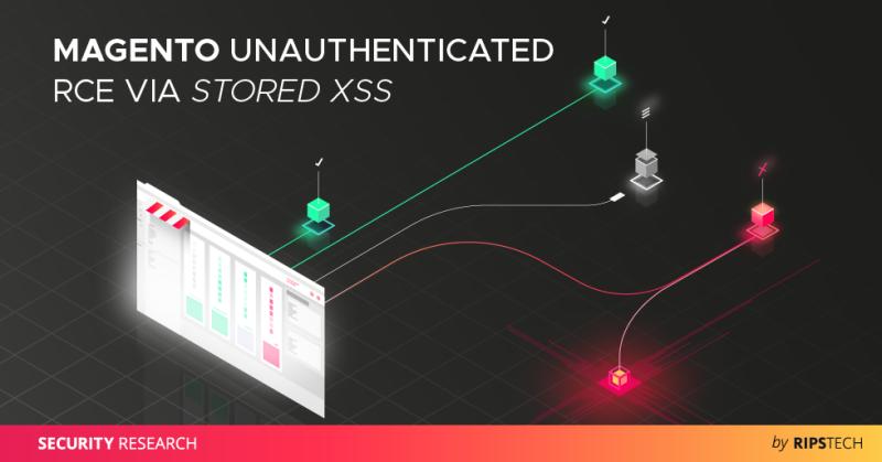
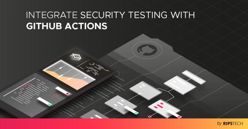
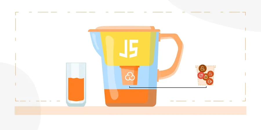
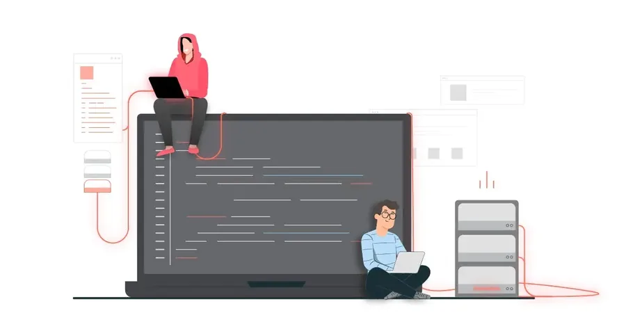
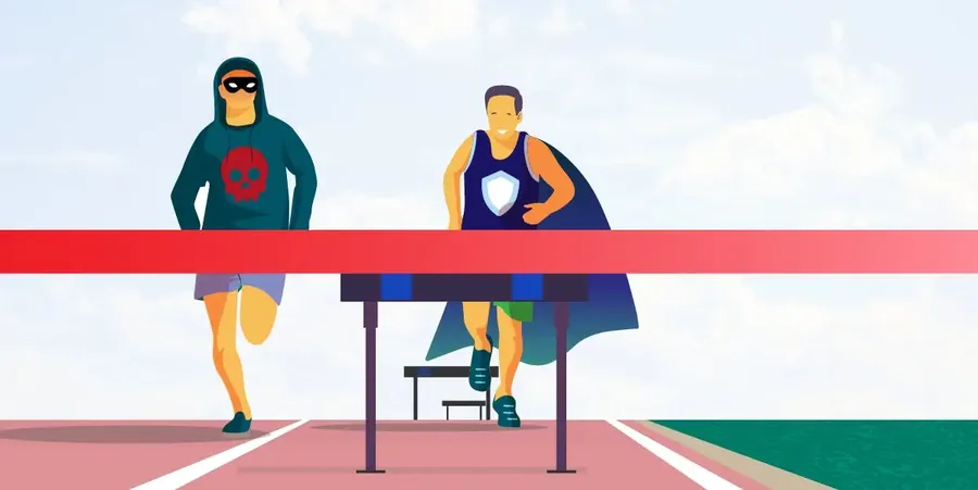
The blog brought in organic traffic, steadily and more than anyone expected. Each post got its own illustration, so it looked as good as the research inside it.
Five scales with a value and two examples each — one on-brand, one off-brand. Written this way because examples constrain a generator and adjectives do not.
ONData flow tracking from source to sink, across files.
OFFPowerful security insights at your fingertips.
ON70 of 100 findings are wrong. Your scanner is loud.
OFFSignificantly reduce false positives and improve developer productivity.
ON16 criticals in this scan. Start with Order.php.
OFFGreat news — we found a few things for you to look at!
ONThe parameter is not bound and not escaped.
OFFYo, this query is wide open lol.
ONWatching hackers turn exploits into funnels.
OFFBugs beware — RIPS is on the case! 🐛
ONStatic analysis finds this class of bug. It does not find logic errors.
OFFComplete protection against every threat, guaranteed.
| Say | Not | Because |
|---|---|---|
| finding | issue, alert, threat | A finding is a claim the tool makes. It can be wrong, and the product says so. |
| critical / high / medium / low | urgent, severe, minor | Four words, fixed, mapped to four colours. |
| false positive | noise, nuisance | It is the industry term and the customer already uses it. |
| scan | audit, assessment | An audit is a person. A scan is the product. |
| static analysis | AI-powered, next-generation | The method is the differentiator. Hiding it loses the argument. |
The short version. If someone reads one page of this book, it should be this one — and it is also what chapter 12 hands to a model as guardrails.
Six screens that carry the argument: the scan is loud, the product’s job is to make it quiet. Severity is the spine — the same four colours run from the KPI row down to a single highlighted line of PHP.
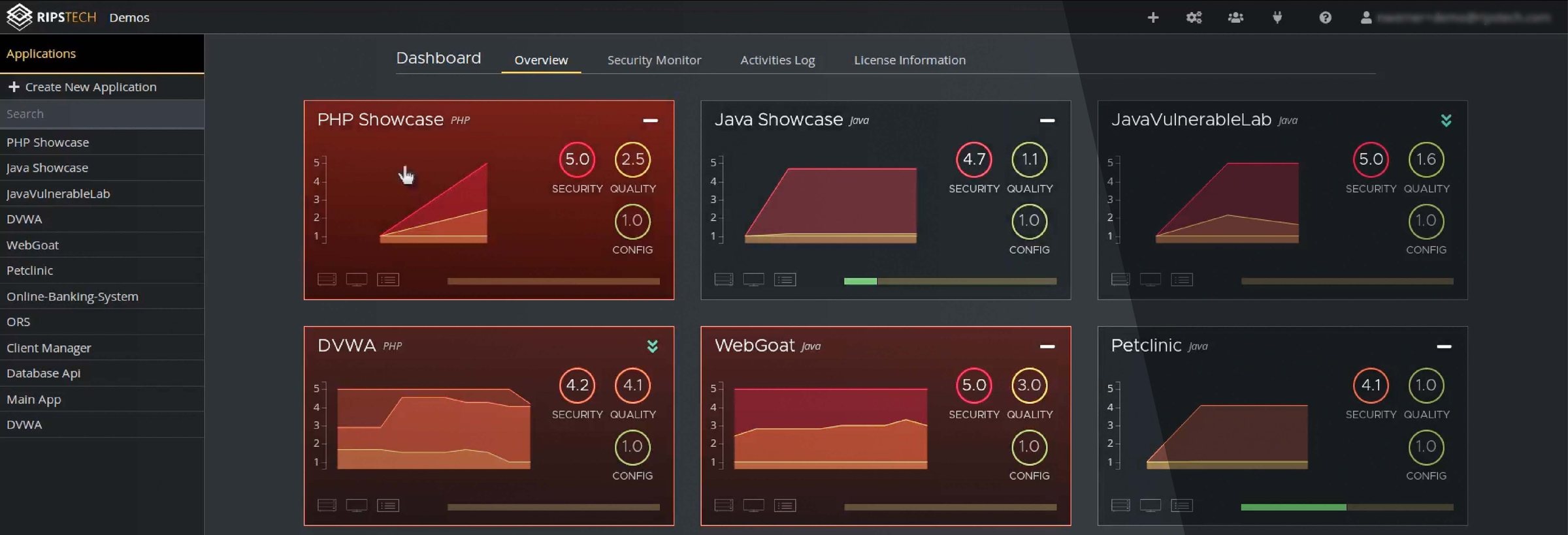
How a finding gets its severity, and what happens to a decision once a reviewer makes it.
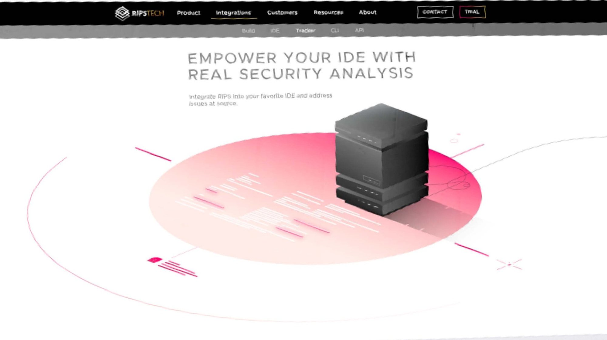
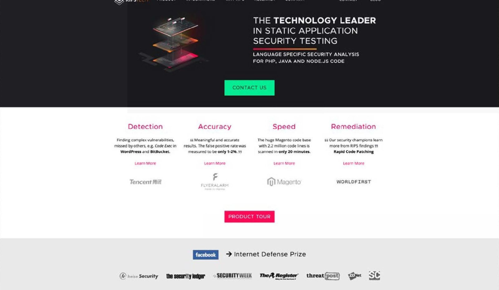
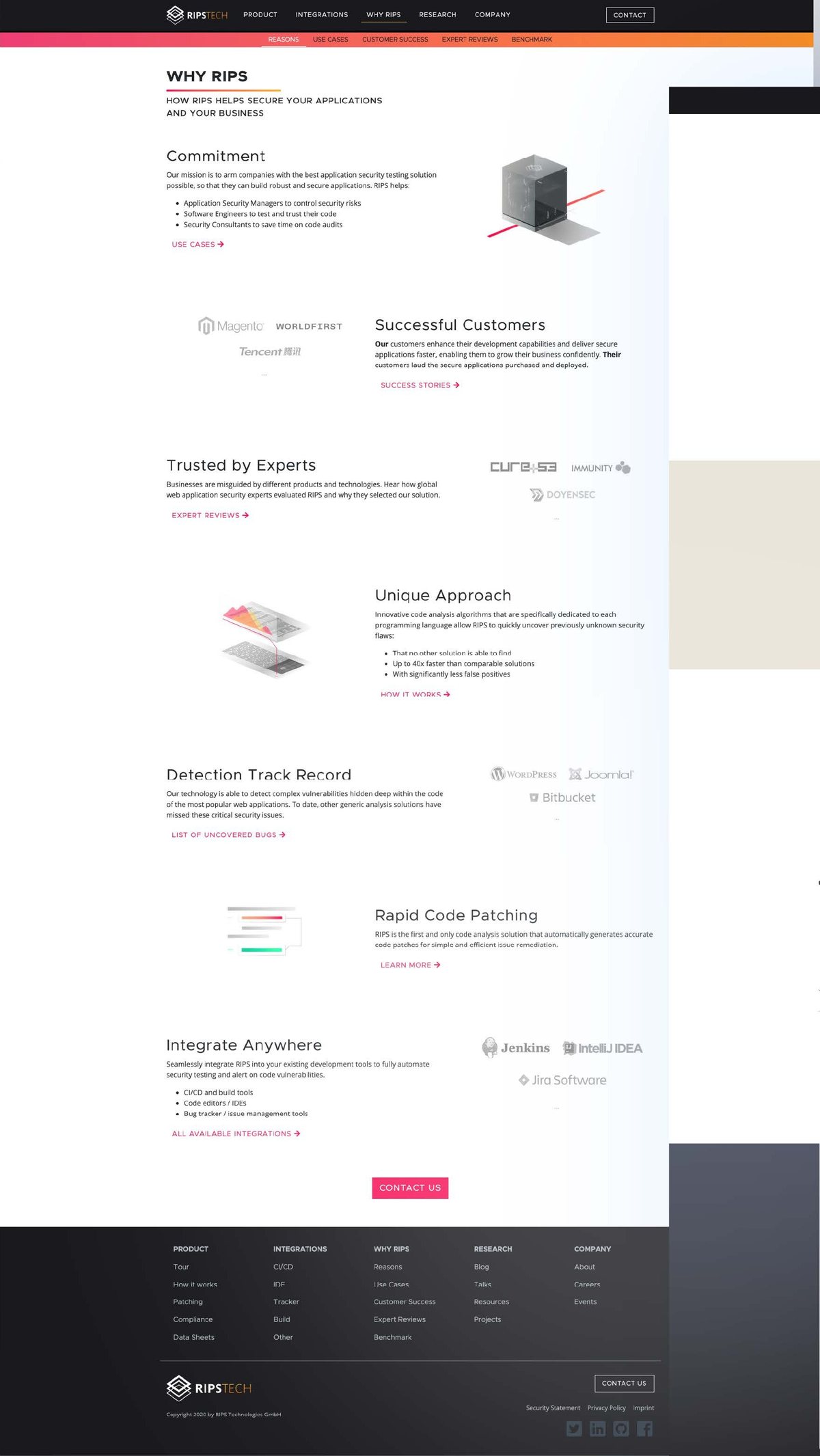
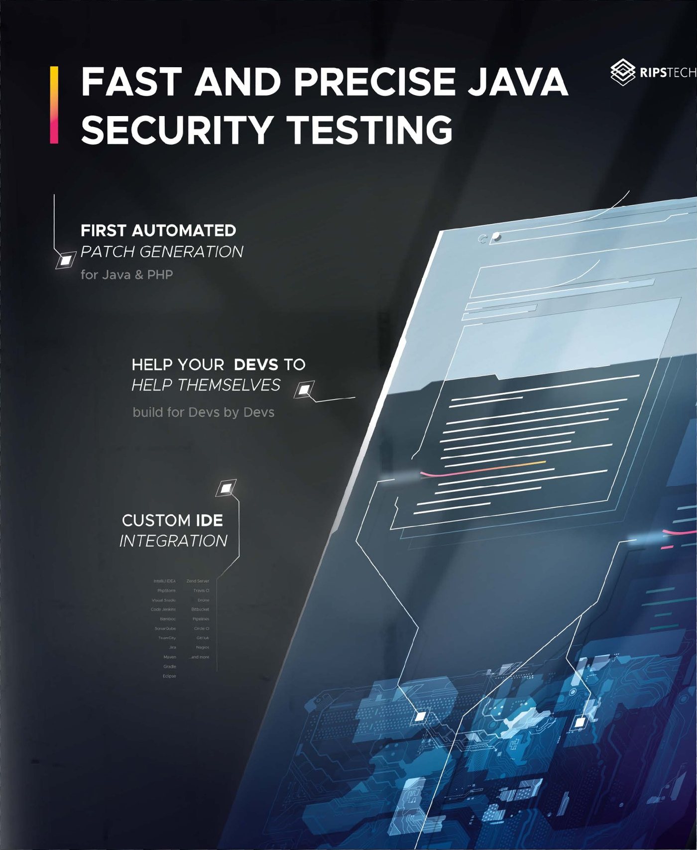
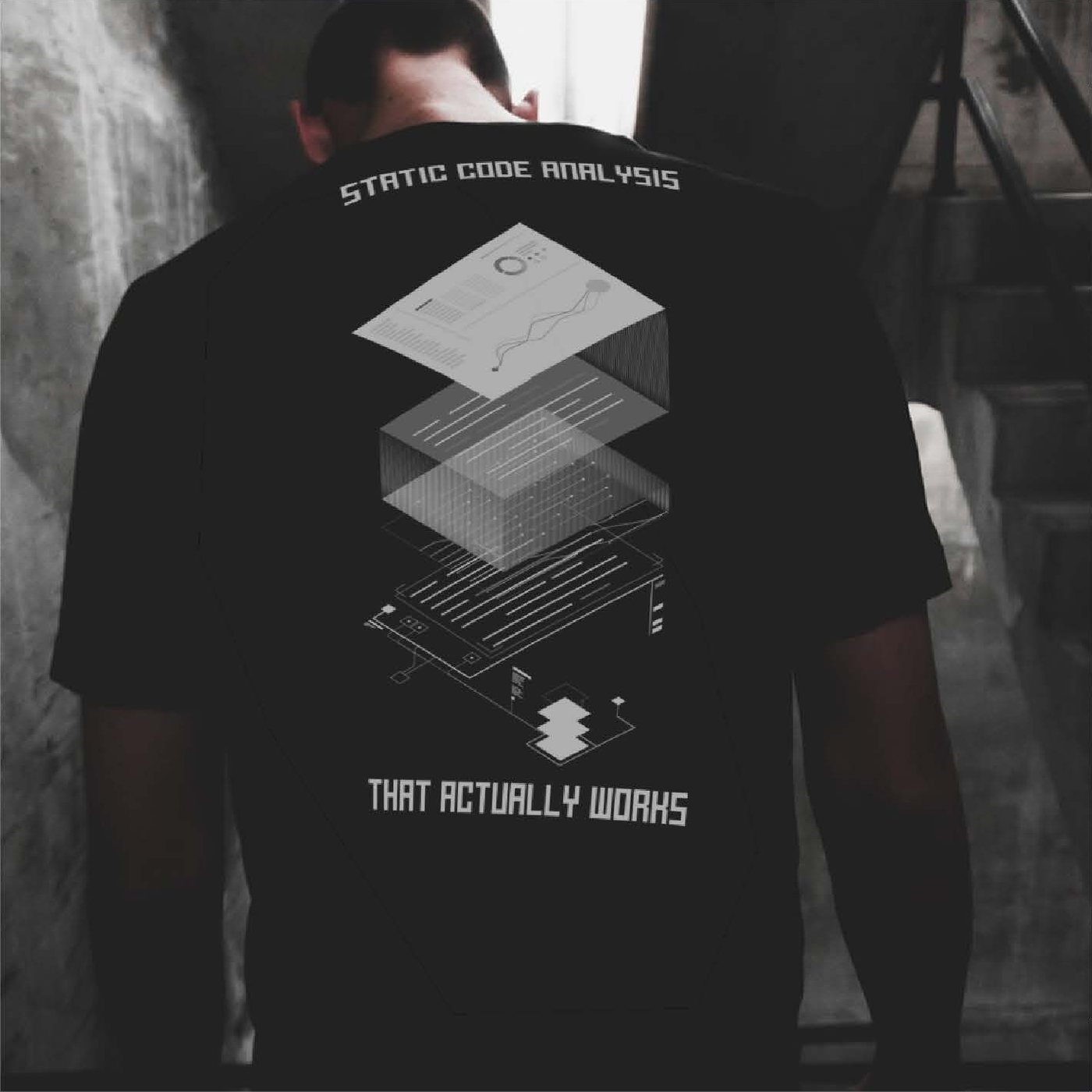
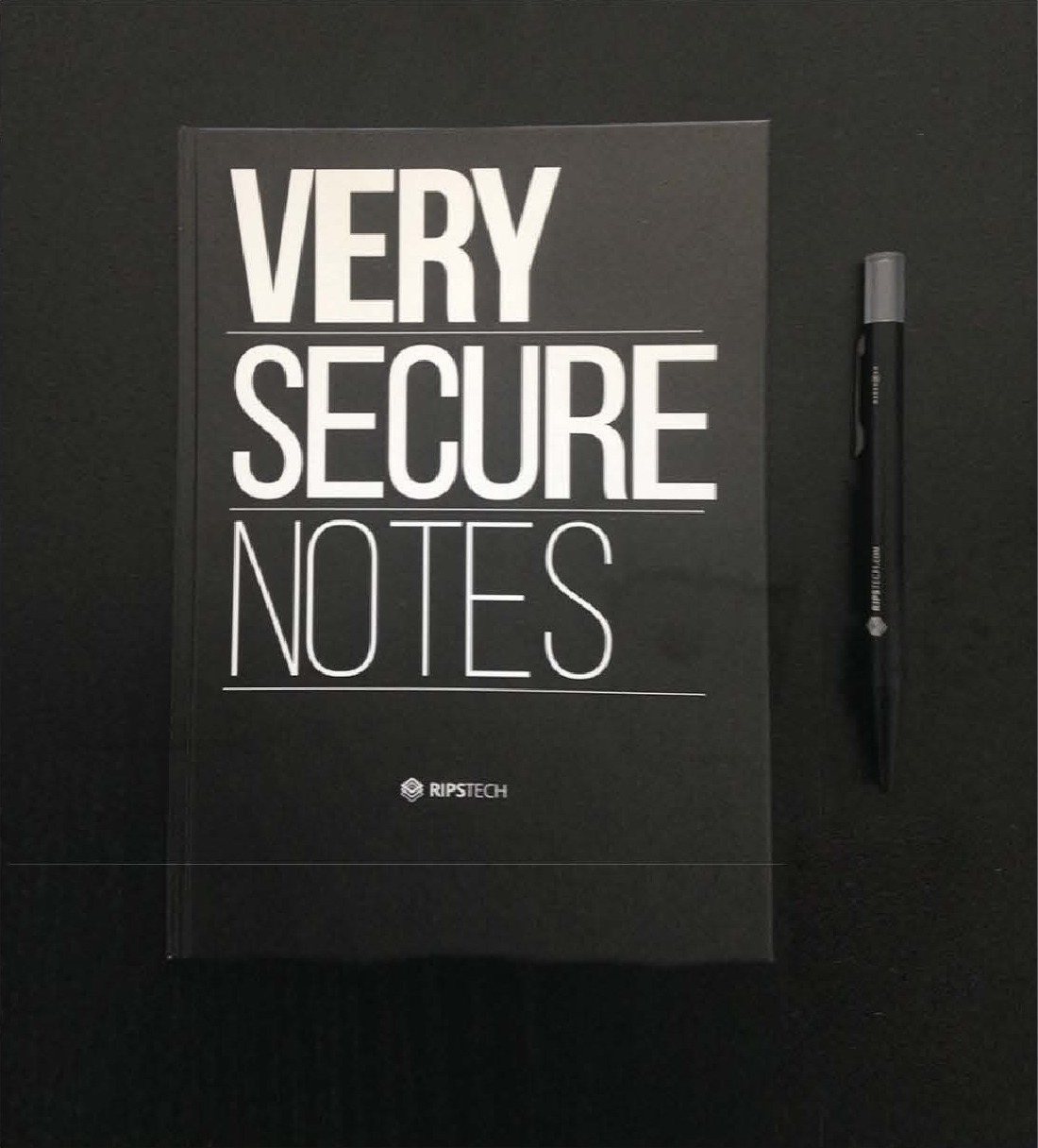
The same system outside the product: website, trade fair, merch, ad motifs and the internal signage. One palette, one mark, no second visual language for the outside world.
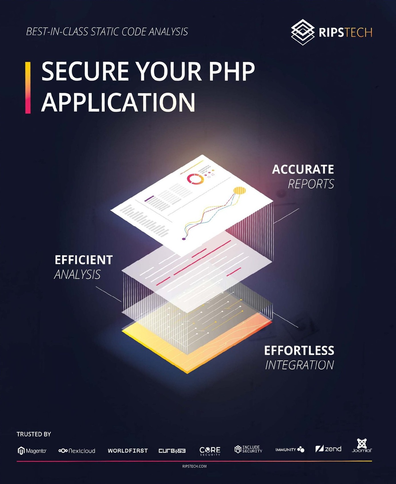
85 × 55 mm. Back: the gradient, mark centred, nothing else. Front: ui/void, mark top left, name and role bottom left, a 2 mm gradient rule at the foot. No phone number, no address, no QR code.
One gradient plane, the lockup at 20% of the wall height, one sentence underneath. The claim changes per show; the wall does not.
Room numbers in mono, hot; room names in sans, ink. The internal wayfinding used the same two styles as the product's data and body text.
Mark only, one colour, no wordmark on fabric. A shirt with a URL on it is an ad; a shirt with a mark on it is a shirt.
The same brand, structured for a model rather than a reader. Headings instead of prose, fixed anchors separated from creative space, and an example on either side of every scale.
# RIPS Technologies — Brand Anchors v1

## FIXED ANCHORS  — never generate, always supply
- logo: rips-mark.svg / rips-lockup.svg (file, not description)
- colours: #FF014D #FF7A33 #FFCB44 #3A0A1E
- neutrals: #0B0E12 #11171E #1B222B #6C7A88 #A9B6C2 #E9EDF1
- type: Open Sans 400/500/600, IBM Plex Mono 400
- icon set: 52 marks, 24 px box, 2 px stroke, solid fill
- radius: 0 · grid: multiples of 4 · motion: 160 ms ease-out
- terms: finding · false positive · static analysis · source · sink
          · critical · high · medium · low · CWE-nnn

## CREATIVE SPACE  — free to generate
- backgrounds, gradient plates, composition, crop
- secondary copy, headline variants within the scales below
- layout of product screenshots inside a page

## SCALES  — value, then one example each way
### Technicality 8/10
- ON:  Data flow tracking from source to sink, across files.
- OFF: Powerful security insights at your fingertips.
### Directness 9/10
- ON:  70 of 100 findings are wrong. Your scanner is loud.
- OFF: Significantly reduce false positives.
### Warmth 3/10
- ON:  16 criticals in this scan. Start with Order.php.
- OFF: Great news — we found a few things for you to look at!
### Formality 5/10
- ON:  The parameter is not bound and not escaped.
- OFF: Yo, this query is wide open lol.
### Humour 2/10
- ON:  Watching hackers turn exploits into funnels.
- OFF: Bugs beware — RIPS is on the case!
### Certainty 7/10
- ON:  Static analysis finds this class of bug. Not logic errors.
- OFF: Complete protection against every threat, guaranteed.

## ALWAYS
- Use the supplied logo file, unmodified.
- State a number when there is one.
- Name the vulnerability class and its CWE.
- Put the severity word next to the severity colour.
- Square corners. Spacing on multiples of 4.
- Real product screens, numbers that add up.
- Gradient runs hot → warm, never reversed.

## NEVER
- Redraw, recolour, rotate or restyle the mark.
- Promise protection, prevention or complete security.
- Padlock, shield, keyhole, binary rain, hooded figure.
- #FF014D on body copy or behind running text.
- A third typeface. A rounded corner. An italic.
- Exclamation marks or emoji inside the product.
- Invented quotes, logo walls or metrics.
Roughly 400 words. That is the point — it fits in a context window next to the actual task, which a 40-page PDF does not.
Next case study · 02
Case study 02 · SonarSource · 2020—2022
SonarQube grew out of its open source roots into a tool almost every developer has run.
Build marketing where there had been none, relying on organic growth and reputation alone. Tell and illustrate product stories across SonarQube, SonarLint, SonarCloud and the security analysis that came with RIPS.
Marketing became a department: from the first eight people to thirteen.
Over the same two years Sonar grew to more than 16,000 paying customers and $175M in annual recurring revenue, growing about 50 % a year.
In April 2022 it raised $412M at a $4.7B valuation, partly to grow marketing further.
Came across with the RIPS acquisition as one of the first members of Sonar’s marketing team, and worked in the design team too. Marketing strategy and interface work across all three products, SonarQube, SonarCloud and SonarLint, with most of my time on the funnels.
Developers don’t want to be sold to. What worked was showing the product, backing every claim and testing every page.
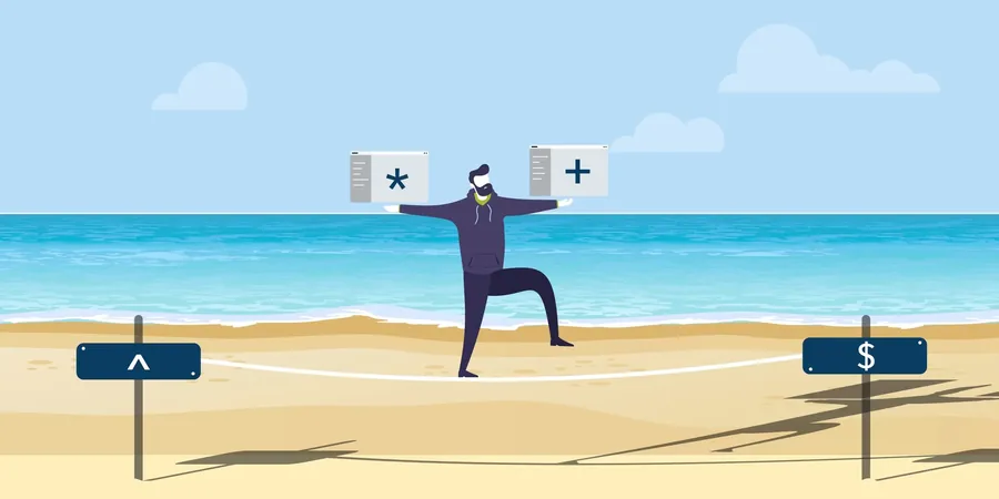
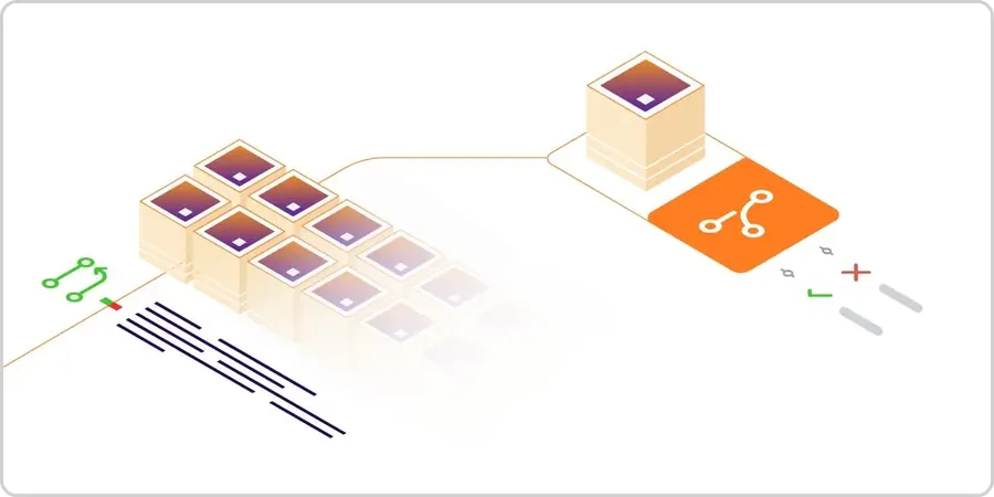
SonarSource bought RIPS in May 2020, and the whole Bochum team moved over. I joined Sonar’s first marketing team: eight people, working closely with one product manager per product. Sonar had never needed marketing. Developers found SonarQube on their own, the open-source name did the rest. With RIPS it moved into code security, where most people still saw a code quality tool. So we built what was missing: funnels for three products, A/B tests on every page, the first blog posts. The team grew to thirteen.
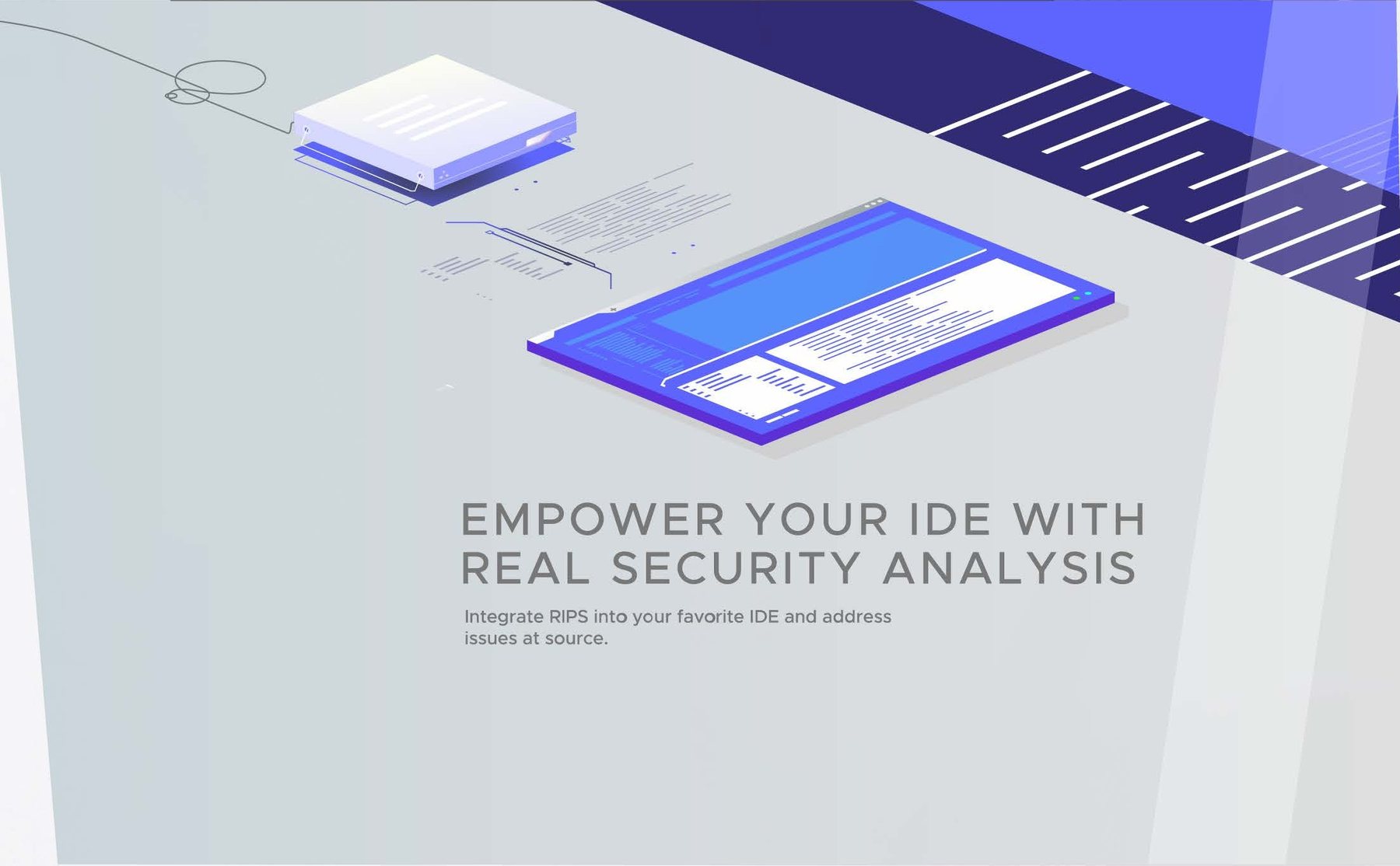
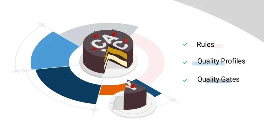
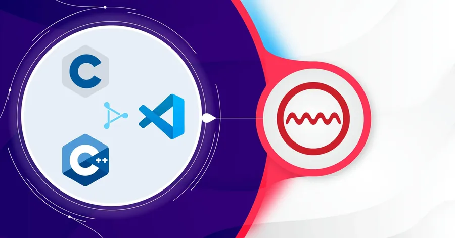
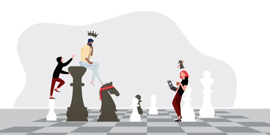
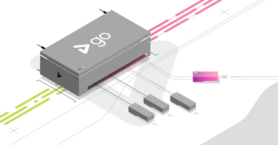
SonarLint, SonarQube and SonarCloud ran side by side, each for a different place where code lives: the IDE, the team’s own servers, the cloud. Underneath all three sat the same SonarQube analysis.
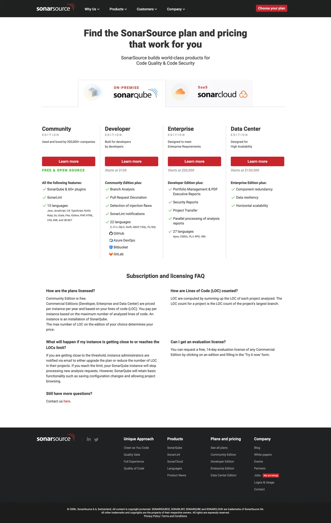
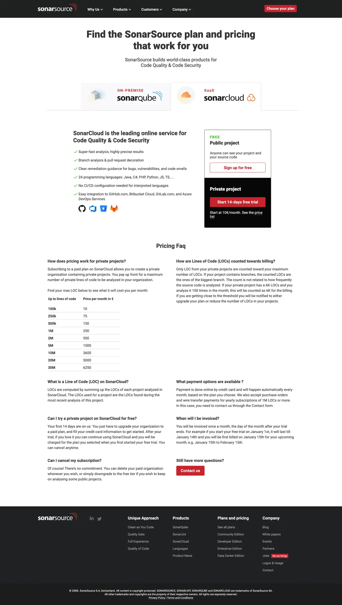
Each product had its own site, built to get people to a download or a trial. These were also the pages we tested every week.
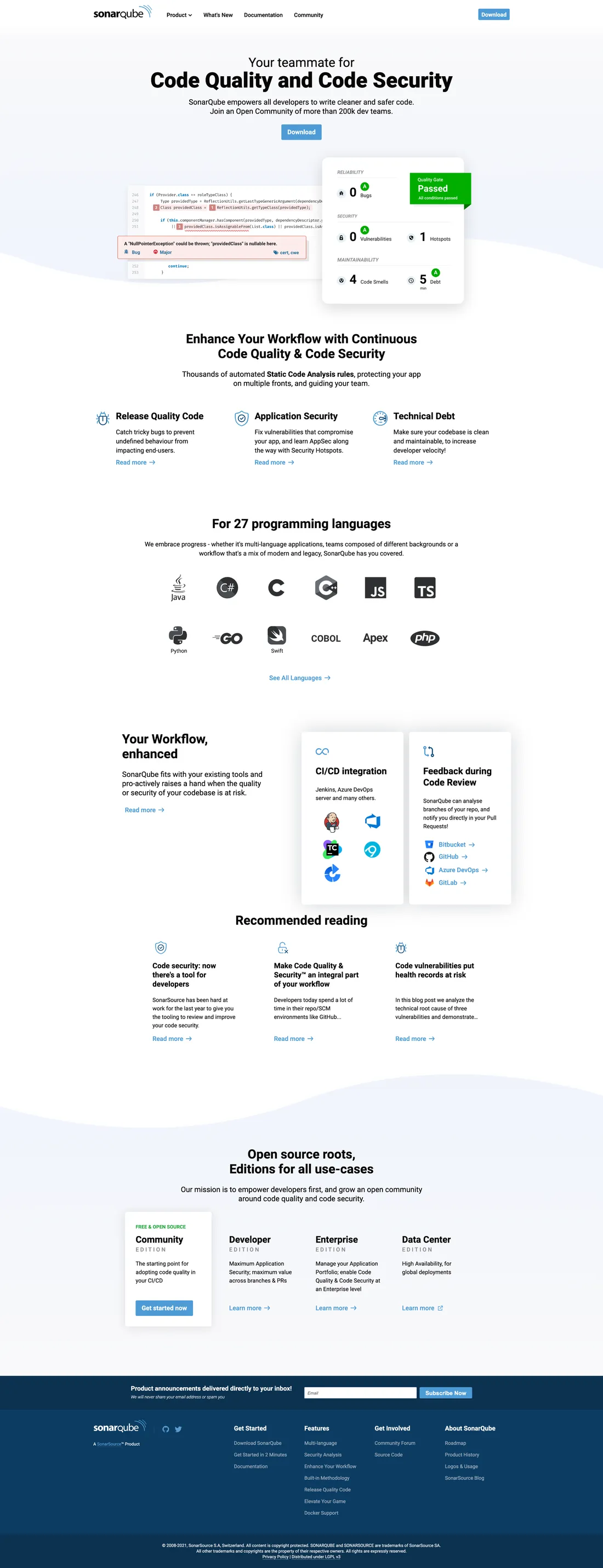
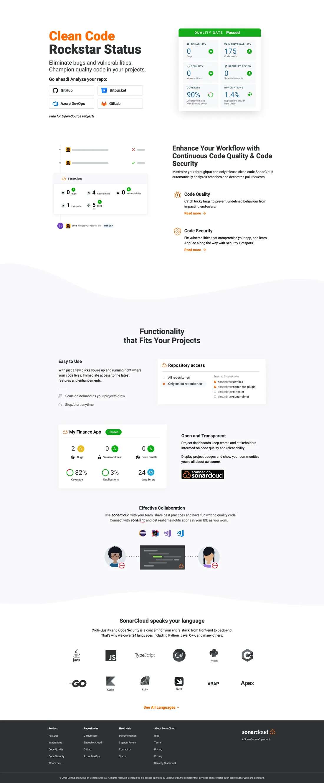
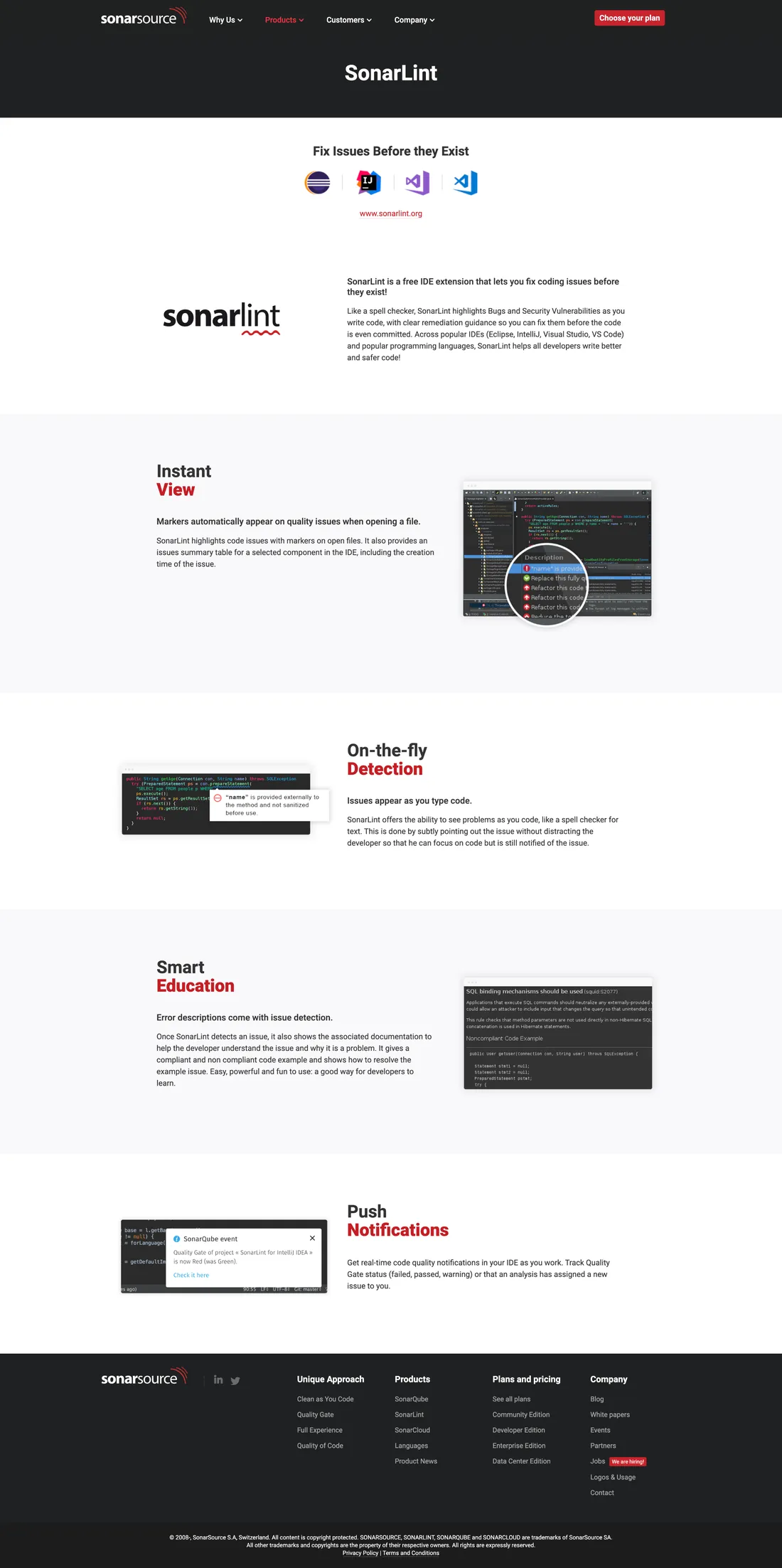
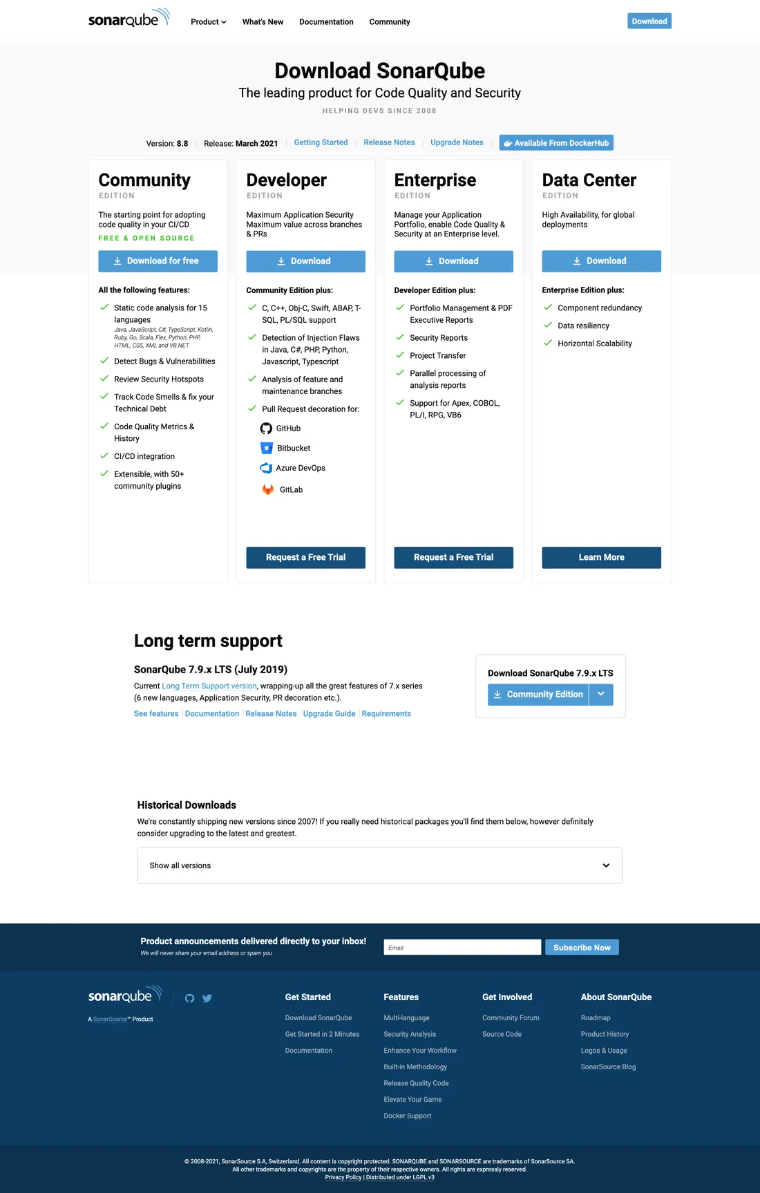
Every week, each product’s pricing page got at least one A/B test. We changed one thing, kept the version that won and started the next test.
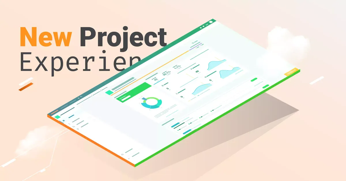
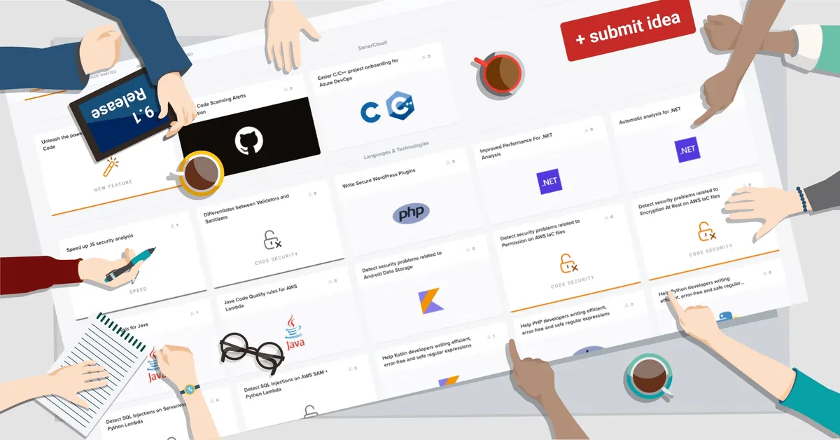
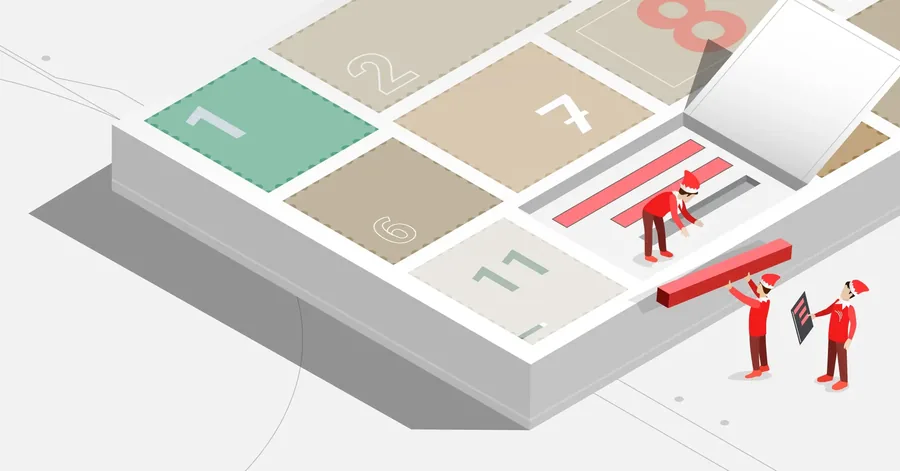
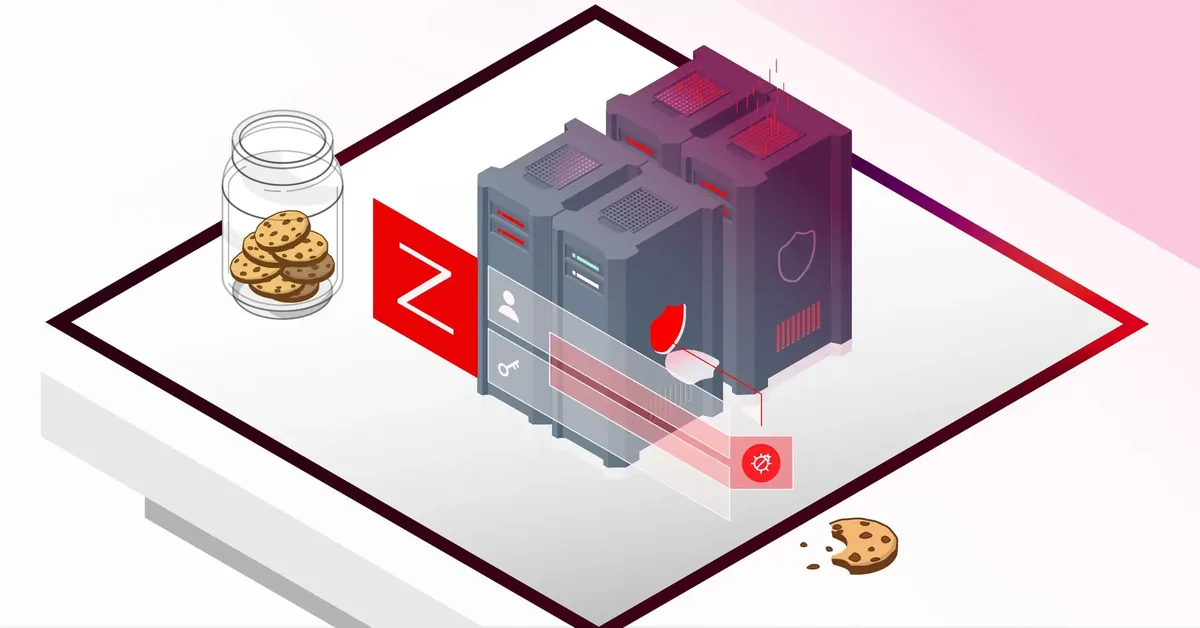
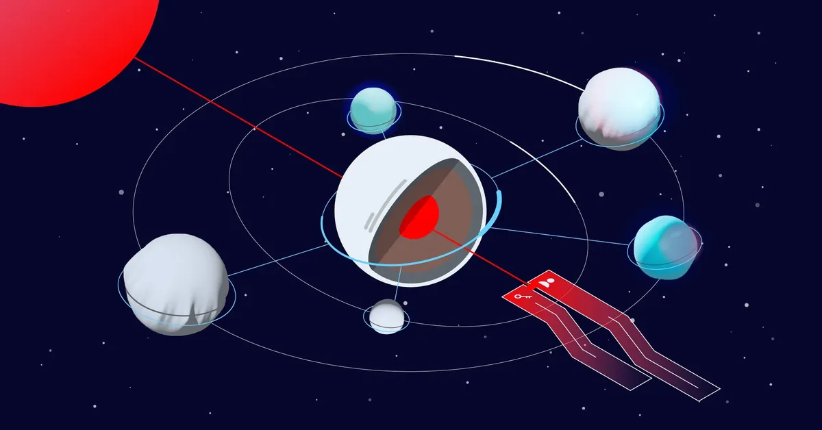
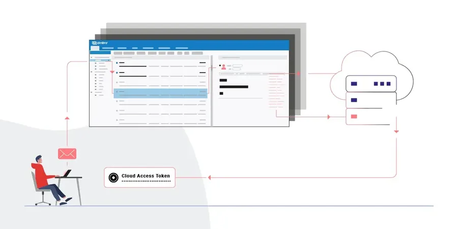
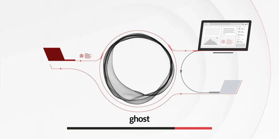
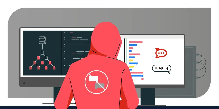
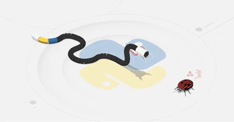
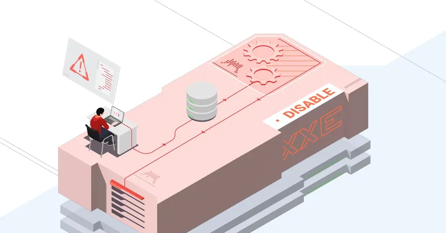
The blog had no designer, so I took it on and worked towards one visual language for every post. At RIPS that came easily. At Sonar more people had a say, and each product manager ran their product their own way. Before any real UX work I had to win people over, while I was still new there myself.
Next case study · 03
Case study 03 · Lotum · 2022—2026
1 billion installsApril 2025
About 50 people in Bad Nauheim, making word and quiz games for phones. More than 50 titles, 4 Pics 1 Word and Word Blitz among them.
Word Blitz already had millions of fans. The job was to keep it growing, with more depth in the features they knew and new players on top.
Years of steady growth. The player base held its size, something few free-to-play games manage, and ARPDAU climbed until it covered what we spent on user acquisition.
The only designer in a team of five to eight, responsible for the whole player journey: onboarding, user tests, the season shop, limited-time offers and near-miss moments. Also the ads, the store pages and the agencies around the game.
I learned that friction, built in on purpose and against every UX law, makes players play more, not less, and how to back up counterintuitive data like that.
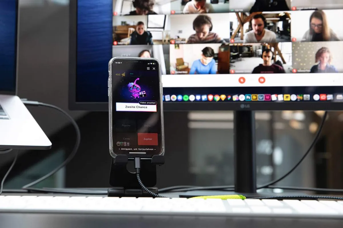
I came to Lotum from Sonar, wanting to grow technically and see mobile games from the inside, one of the biggest markets there is. For four years I looked after Word Blitz, a word duel against the clock: more than 100 million players, over a million every day, and me as the only designer in a team of five to eight.
Tests, numbers and prototypes stay with Lotum. The features that shipped are still in the game, and you can play them yourself.
Features went through the same stages, from a sketch with the product manager to an animation built with the sound designer. The home screen and its books are one example.
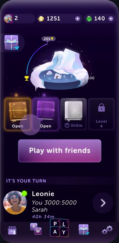
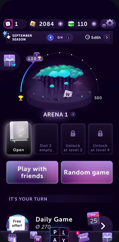
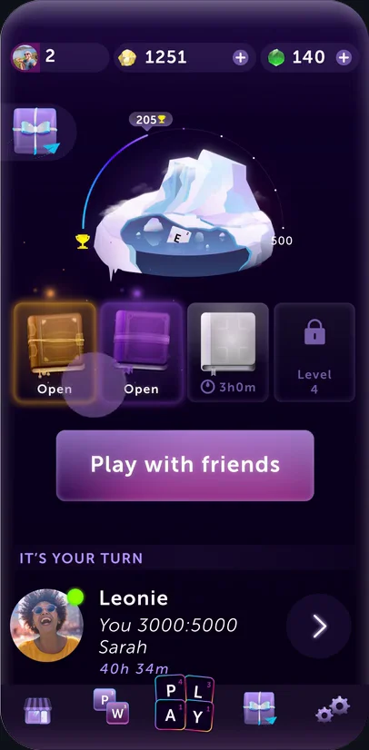
UI, both A/B screens and the animation come from the live game and from Lotum’s design jobs page, which I co-designed. Sketch and wireframe redrawn for this page.
The old icon’s colours were dated and it failed the usability test, so I pushed for a redesign. New installs went up 8 %. We had expected 2 %.
New installs after the change, in %
Ads ran across markets on Facebook, static and animated, and on several other channels. The store pages on the App Store and Google Play were part of the same work, and so was looking after the agencies around the product.
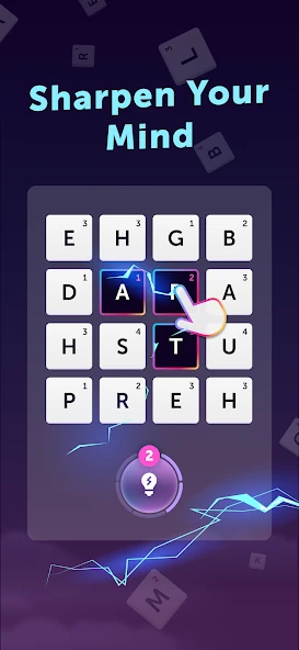
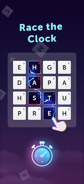
* Word Blitz, its artwork and all screens shown here belong to LOTUM one GmbH. They appear only to document my own work on the game. Recordings and store images come from the public live game and its store pages; sketch, wireframe and diagrams were redrawn for this page.
Next case study · 01
Case Study 04 · Echo Zero
A solo-developed cyberpunk parkour brawler built in Unity 6 URP.
Build the game I want to play myself, a modern-day Oni, and find out how far I get on my own when AI writes the code.
A first level, six systems built with AI and 35 brands for the world. The game is parked, not abandoned.
Design, story, levels, 3D, branding and the system architecture. AI agents wrote the code from my specifications.
I learned to decide quickly whether something is faster by hand, with the AI or with a tool I build for it.
I like to test the true limits of new technology. With Echo Zero, I set out to explore a new workflow: AI writes the code; I make the design decisions.
Directed by Me. Coded by AI. All core systems in Echo Zero run on code generated through AI. My role shifted from traditional programmer to technical director—defining system requirements, orchestrating tools, and debugging logic when outputs diverged from the vision.
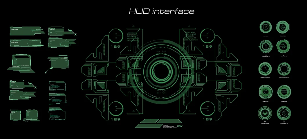
From Cassette Futurism to Graphic Realism. I initially aimed for a high-density Cassette Futurism aesthetic—phosphor green displays, analog dials, and heavy mechanical control panels. However, this required intense manual asset creation that generative image models couldn’t reliably deliver.
I pivoted to Graphic Realism: a high-contrast style defined by strict, repeatable design rules.
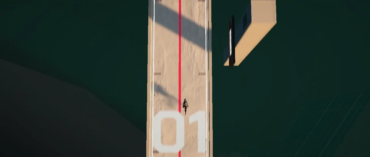
Scaling Surface Detail with Custom Tooling. A large, featureless wall lacks human scale—it could be 2 meters tall or 20. Adding micro-details solves this scale problem and contextualizes the architecture.
Manually detailing an entire sci-fi city was unfeasible, so I directed AI to build a customized Greeble Panel Generator to execute my style rules automatically.
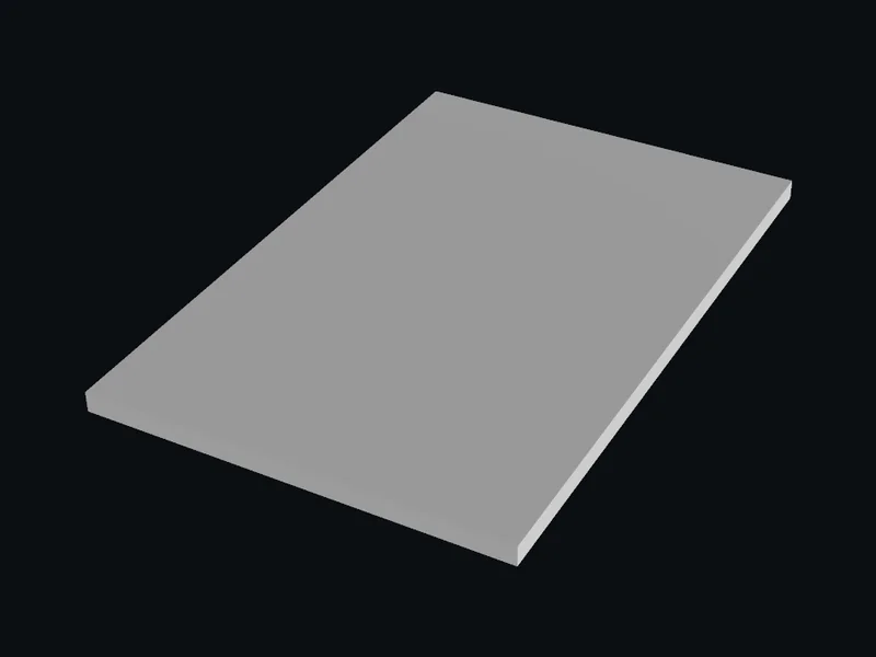
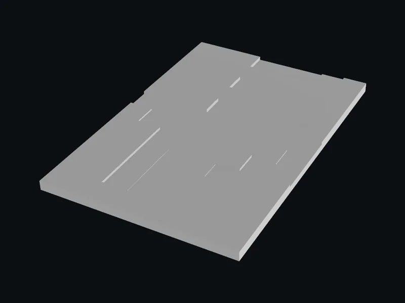
26 reusable panel presets ranging from small wall panels (4 × 6m) to massive structural facades (12 × 12m).
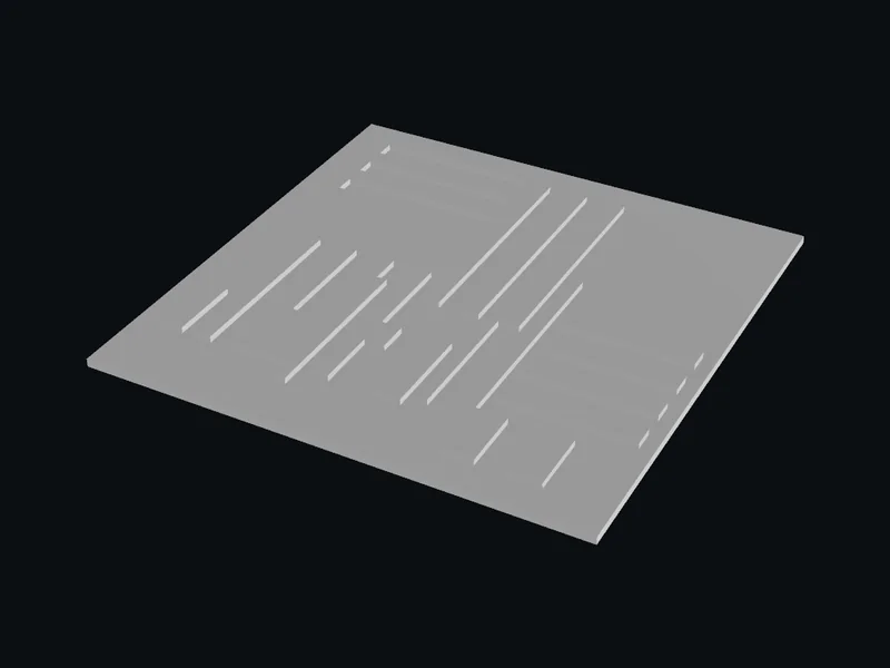
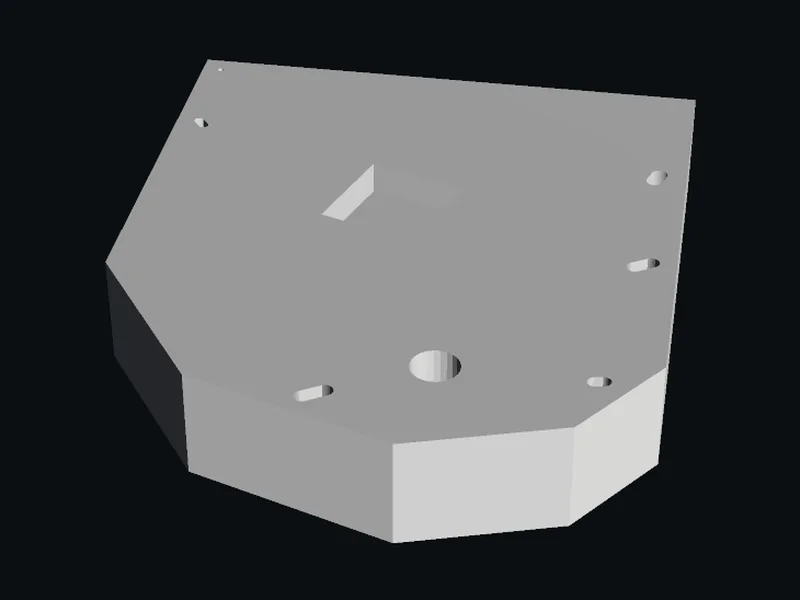
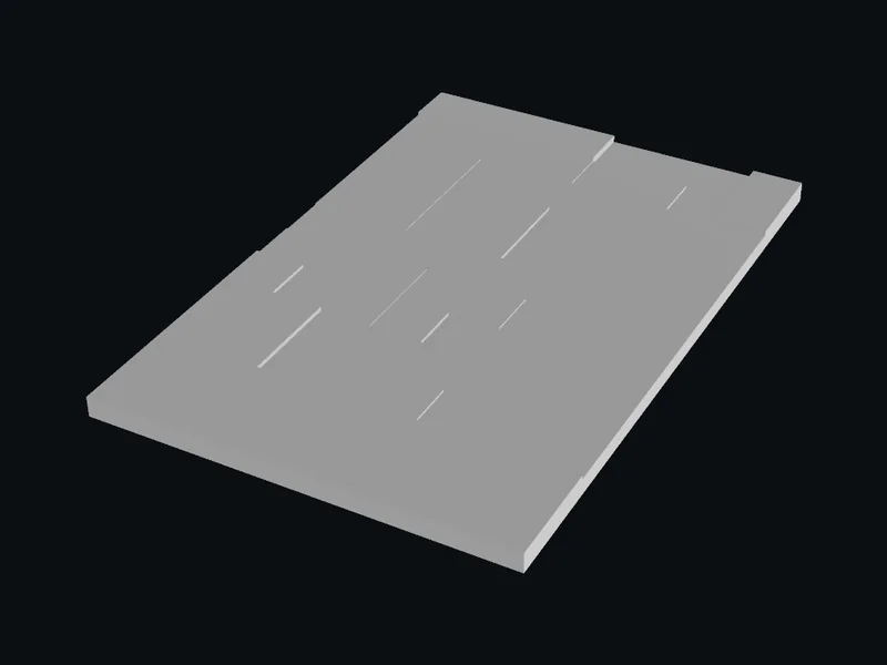
Using AI for Direction, Human Hands for Execution. While I used image generation models early on to explore narrative tone and satire, every final asset in the game was drawn by hand.
Crafted in Figma for high-impact worldbuilding.




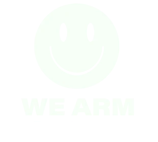





























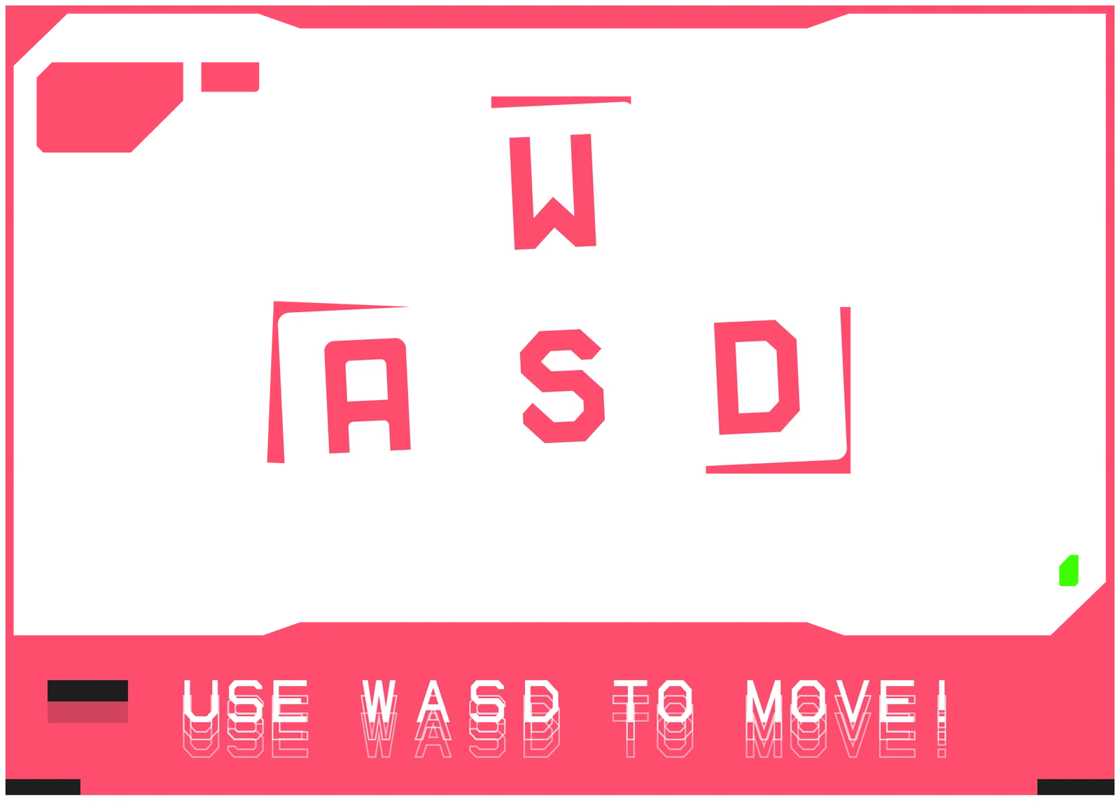
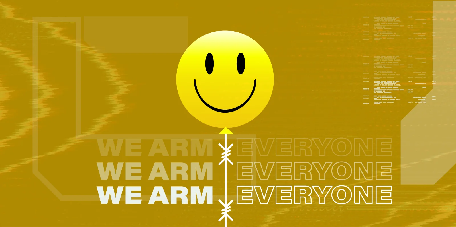
Billboards like “We Arm Everyone” and environmental tutorials like “WASD Movers” seamlessly teach mechanics while expanding lore.
Steam requires explicit AI asset disclosure, and players value human artistry. By drawing every final visual asset myself, Echo Zero maintains 100% human-crafted visual integrity.
A New Paradigm for Solo Developers. Developing Echo Zero felt like breaking through a technical wall. Capabilities that used to require dedicated engineering teams are now within reach for solo visual directors—shifting the focus from how to code it to what to create.
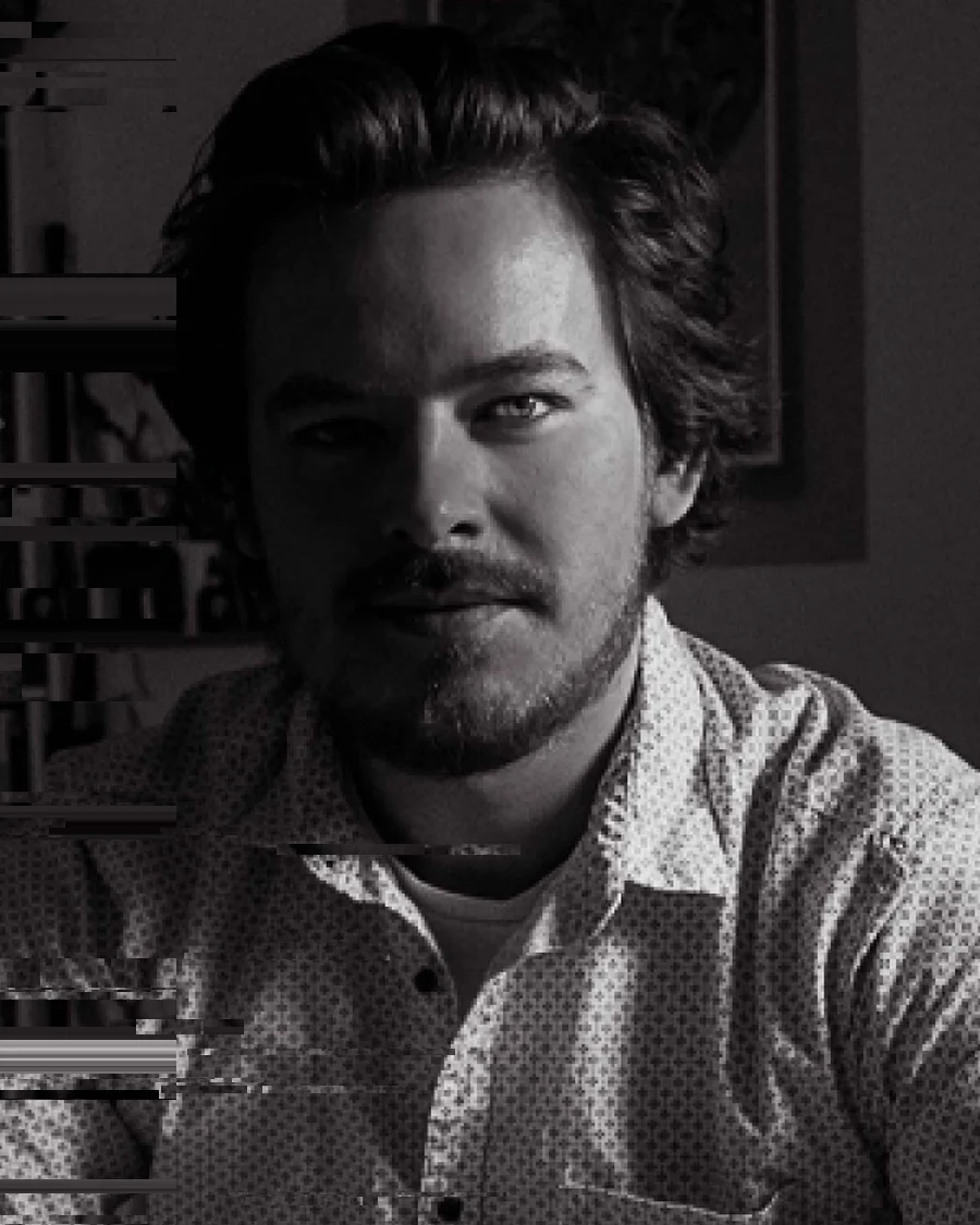
Product Designer
The best projects start with nobody in the room meaning the same thing.
My last name is Diener—German for servant, which is a questionable name for someone who likes to argue. Yet, it describes the job better than I’d care to admit.
My training days belong to the era of skeuomorphic faux leather and hand-painted drop shadows. Countless bits have flowed down the graphic river since then. Today, data dictates the flow and feeds the UI. Tomorrow, those interfaces will likely dissolve under the rise of the agentic web.
I’m here for all of it. Tools change and trends cycle, but the core question remains: How do we perfect the relationship between humans and machines?
Product & Brand Designer
2022 – 2026
Mobile games studio in Bad Nauheim, 50 staff and more than 50 titles. One billion installs by April 2025. Worked on new IPs and on a live title with more than a million daily players. Prototyped and designed features, marketing, strategy and full pipeline for Word Blitz.
2020 – 2022
SonarQube grew out of its open source roots into a tool almost every developer has run. Came across with the RIPS acquisition and worked in both the marketing and the design team. Marketing strategy and interface work across all three products, SonarQube, SonarCloud and SonarLint, with most of my time on the funnels. The same brief as RIPS at a much larger scale.
2017 – 2020
Static application security testing for PHP, Java and JavaScript. 40–50 staff in Bochum, acquired by SonarSource in May 2020 with the team and the site kept as its German R&D centre. Sole designer for three years: product interface, brand, website, every illustration, trade fair stands and the building itself. Identified the missing marketing role, argued for it, and got the hire.
2011 – 2017
act and react agency · W3 Agentur (deputy managing director, team of seven) · Colour Elements (freelance) · Scholz & Friends · Kolle Rebbe · Sparkassen Sportstiftung.
Graduated 2011
Diplom (FH) in Communication Design. Ten semesters, the degree that preceded the bachelor/master split in Germany.